Type: Internship
Timeline: 4 Weeks
Team: Individual
Design System
Figma
How to Establish Consistency Across 70+ Screens and 4 Products?
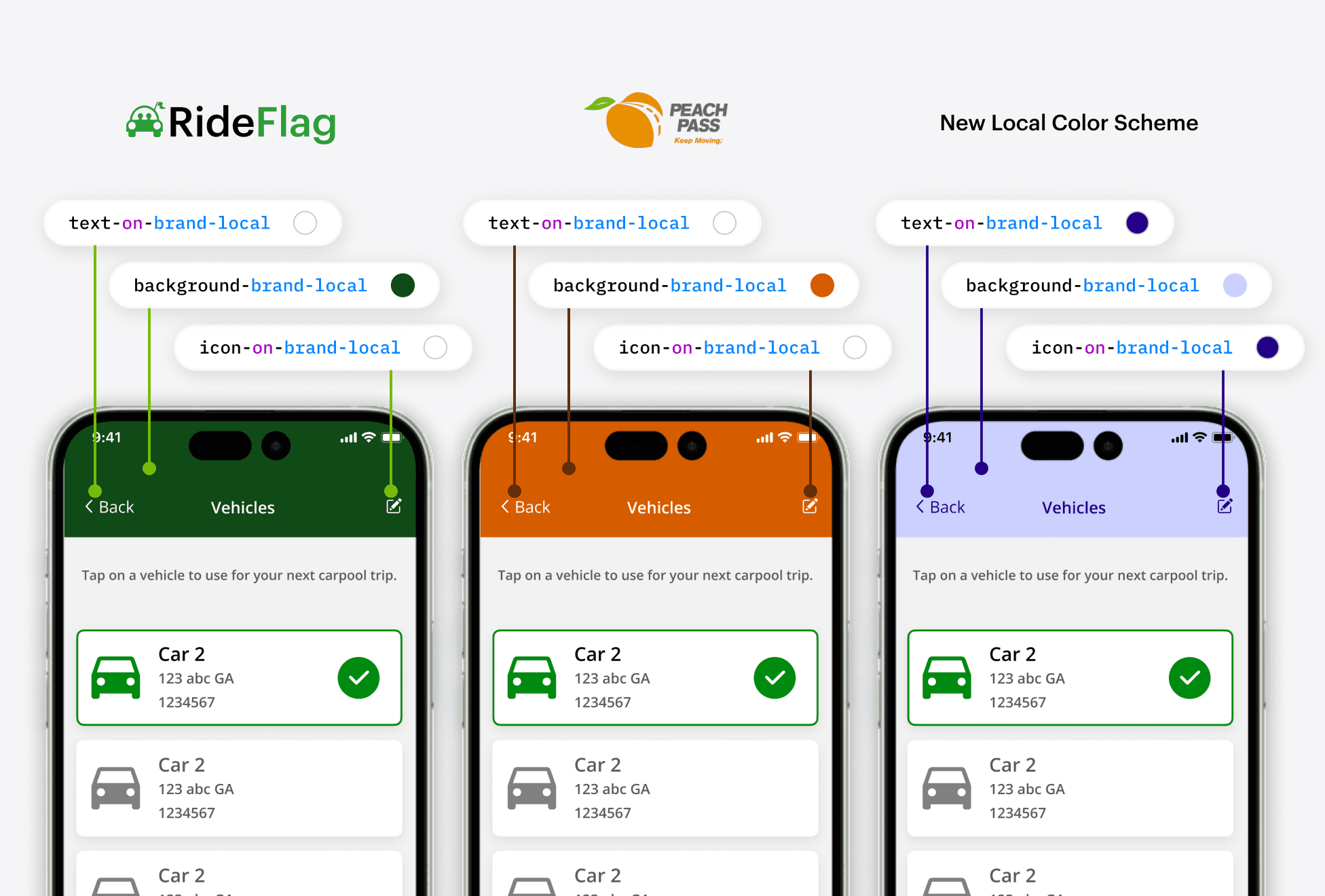
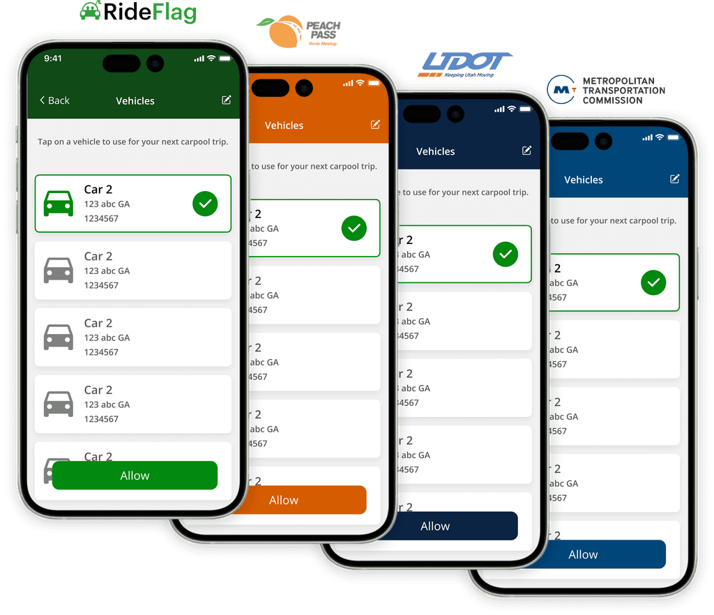
The RideFlag App uses different color schemes based on the transportation ministry under which it's deployed. The existing design system wasn't optimized to easily support this. I led the process of creating a new design system that simplifies the application of these regional color palettes for both designers and developers.
Design Goals
Facilitate Transition to a New Design System
Coordinate with developers, identifying changes and facilitate remapping of old color palette to the new design tokens.
Quickly Apply Regional App Colors
Make applying and testing regional app color schemes easy without having to go through each screen to check for accessibility and legibility issues.
Standardization Across All Products
Setup a single design system that works for all products and unique color schemes.
The Process
Step 1: Audit Current Design System
I coordinated with developers to get a sense of how our current design system was organized. Then I identified room for improvement.
Step 2: Standardize Color Palette
I created a color palette that is mathematically scaled to establish a modular and systematic framework for selecting colors and adjusting colors.
Step 3: Establish Design Token Methodology
I setup design tokens and systematic naming that allows for local color schemes to be applied easily and can be expanded in the future if needed.
Design
Audit Current Design System
Coordinate with Developers
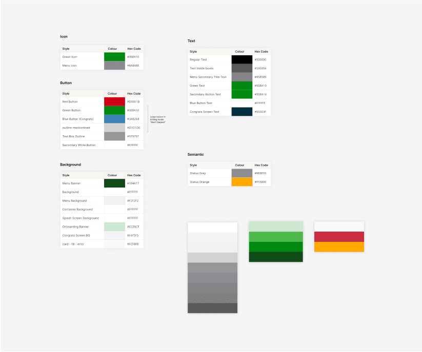
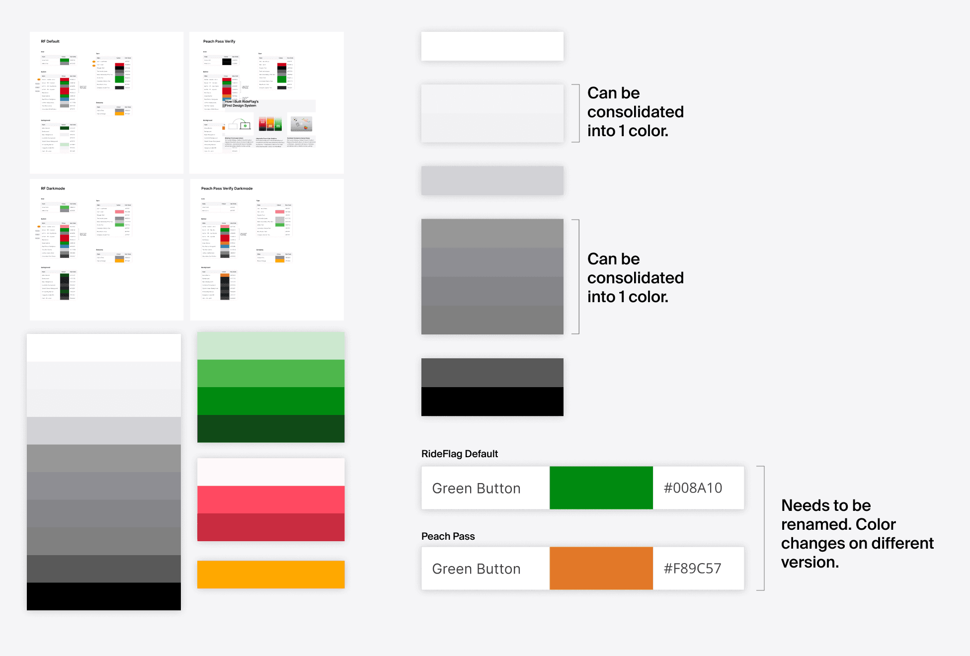
I coordinated with the developers to identify what the current strategy was towards how colors were grouped and named.
Consolidate Similar Colors
I grouped together all the colors being used to identify similar colors that could be turned into a single color.
Identify Naming Issues
I identified color styles that could cause problems in the future. For example "green button" was a color style that would change to orange in another product.
Establish and Test Scaled Color Palette
Existing color lack consistency.
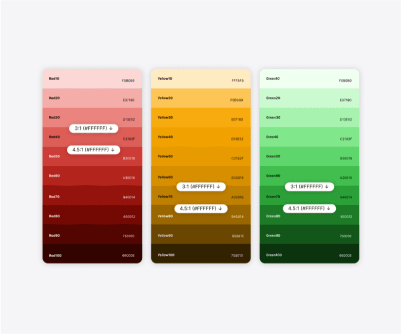
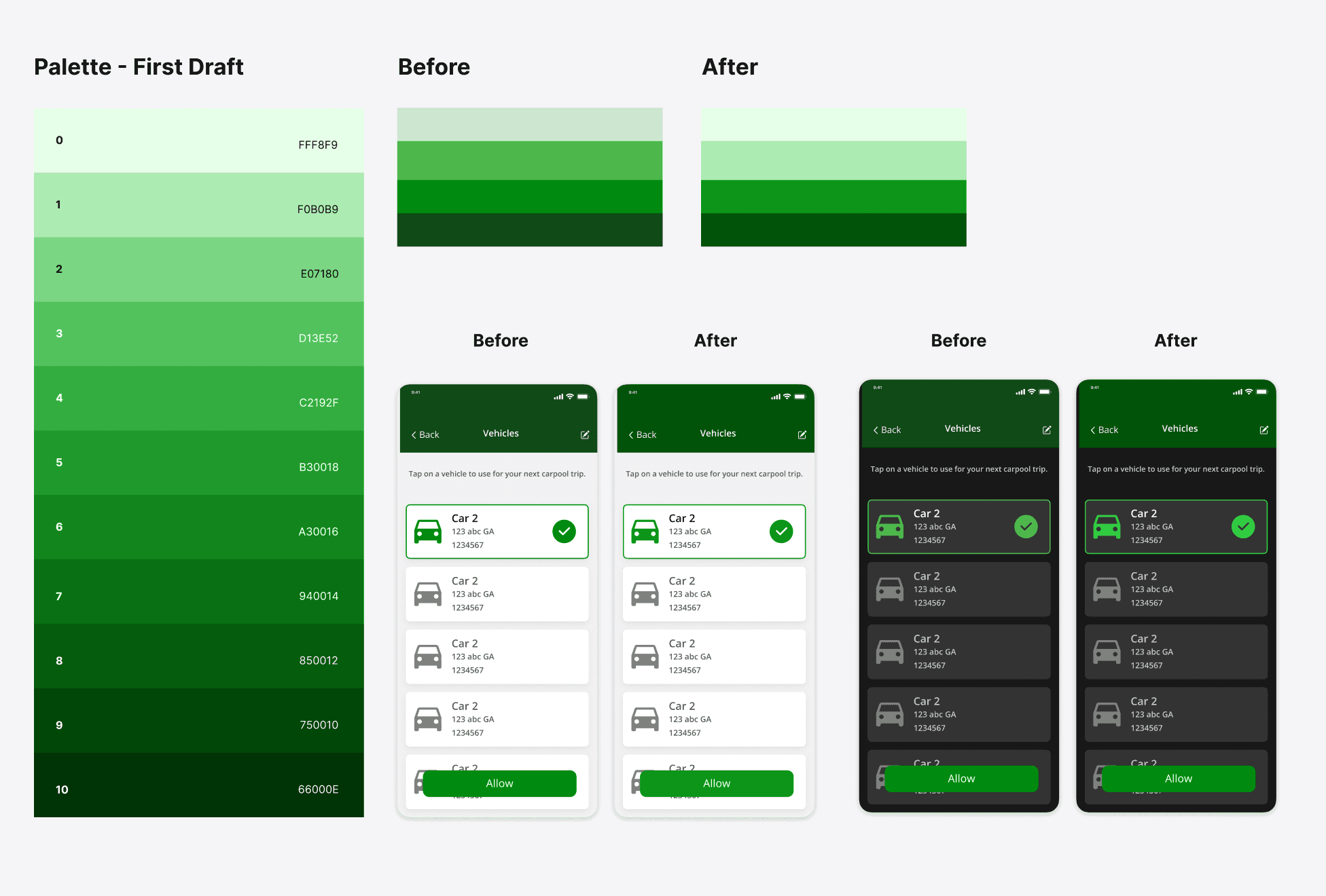
I observed that the colors in use lacked consistency in their relationships. To address this, I created a mathematically scaled color palette, applying precise adjustments to hue, saturation, and brightness.
Remap New Colors and Test on Screens
I then remapped the old colors to the new palette, and tested on screens to assess their impact on the design and made refinements as needed
Refined Color Scaling
Using ColorBox, a program for mathematical color scaling, I adjusted the scaling of hue, saturation, and brightness until the colors in the palette best fitted our needs.
Finalize Color Palette and Naming
Finalize 10 Shade Palette with Naming Convention
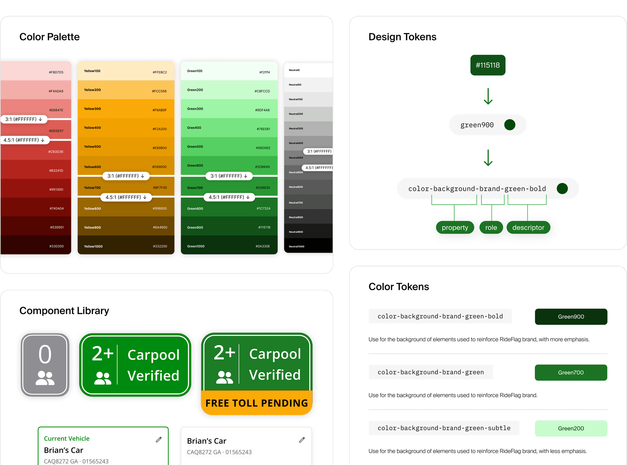
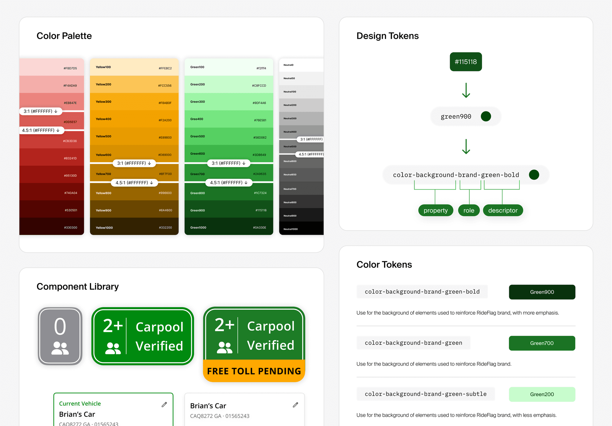
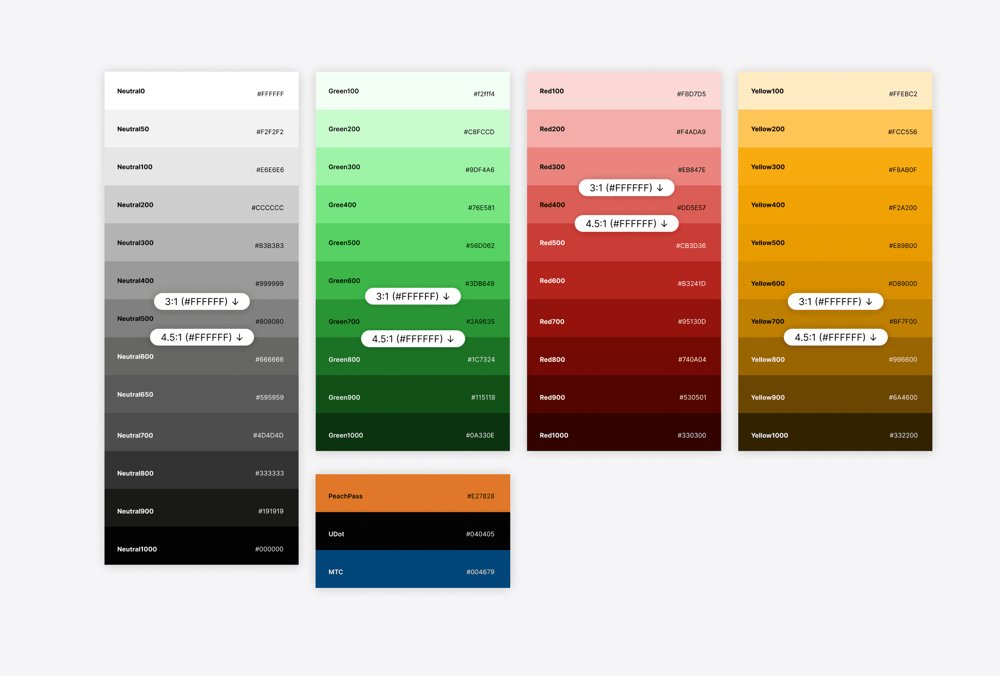
I finalized a 10-shade color palette and implemented a naming convention using 'color + #, for example "green100" or "green1000".
Identify Contrast Ratios for Black and White Text
I also identified which text color to use when using a certain color by indicating contrast ratios for each color.
Setup Design Tokens and Naming
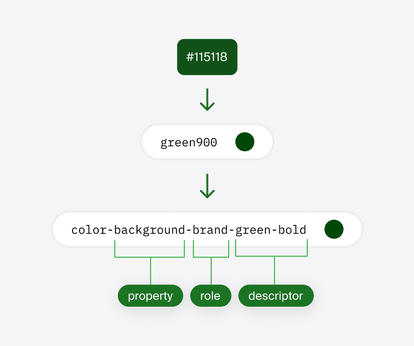
3 Part Token Naming
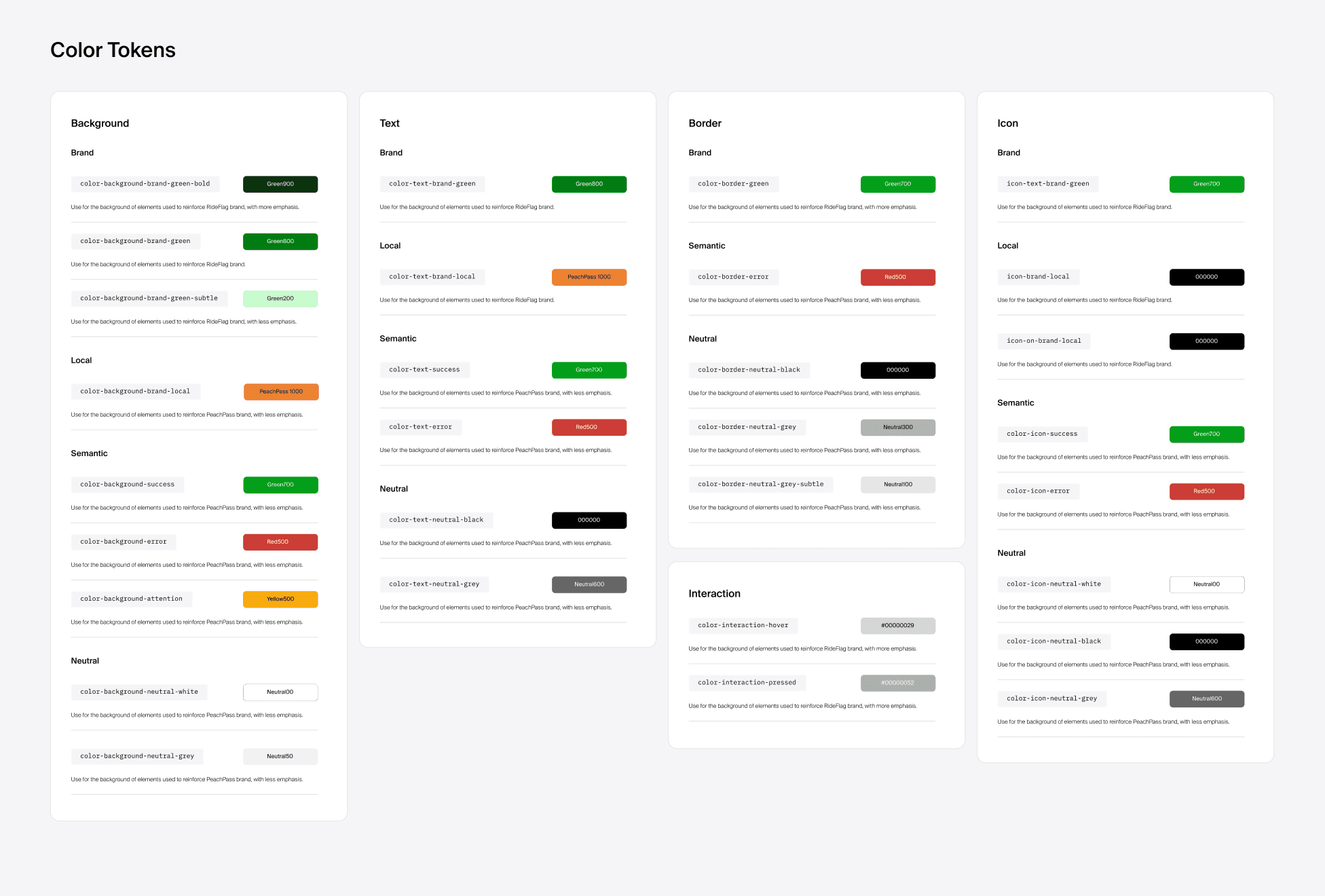
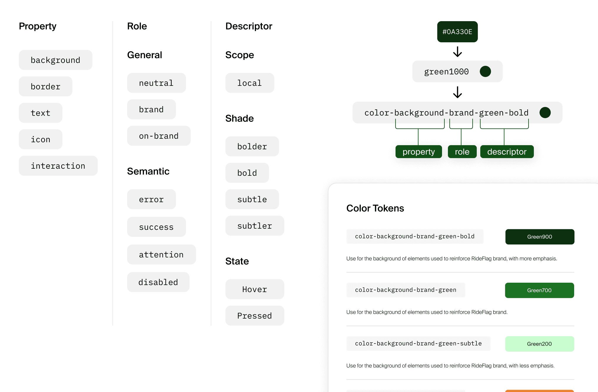
I created a design token organization and naming method consisting of 3 elements: property being targeted, the role of the token, and an additional description.
Tokens are Property-Based, Not Component-Based, for Maximum Flexibility.
Because the RideFlag app is still evolving, tokens avoid referencing specific components like "button" or "car icon" to maintain flexibility, reducing the need for constant updates and easing the developers' workload.
Tokens that Adapt to Local Color Palette
"brand-local" & "on-brand-local"
A unique rule for local brand color tokens is that elements that change based on regional color schemes use the "brand-local" role, while text and icons on these elements use the "on-brand-local" role. This distinction simplifies adjusting local color schemes and identifying their design impacts.
Conclusion
I'm glad I was able to lead this initiative and ended up learning a lot about how a design system is implemented on the developer side. I hope to further test the application of this design system and whether it will continue to align with future developments of the app.
