Data Analytics Dashboard

Data Analytics Dashboard

Data Analytics Dashboard

I designed an MVP for a new dashboard that tracks Power Platform usage of Ontario Government staff, leading the process from discovery phase to a high fidelity prototype.

I designed an MVP for a new dashboard that tracks Power Platform usage of Ontario Government staff, leading the process from discovery phase to a high fidelity prototype.

I designed an MVP for a new dashboard that tracks Power Platform usage of Ontario Government staff, leading the process from discovery phase to a high fidelity prototype.

Type: Internship

Timeline: 2 Months

Team: Individual

UX Research & Design

Data Analytics

Led research and design for a new tool that tracks Power Platform resources and KPIs in the Ontario Government.

TEAM

Power Platform Management and Deployment Team

I was an intern at the Digital Solutions and Innovation Unit, a team that manages Power Platform resources such as licenses and development environments for Government of Ontario staff.

CONTEXT

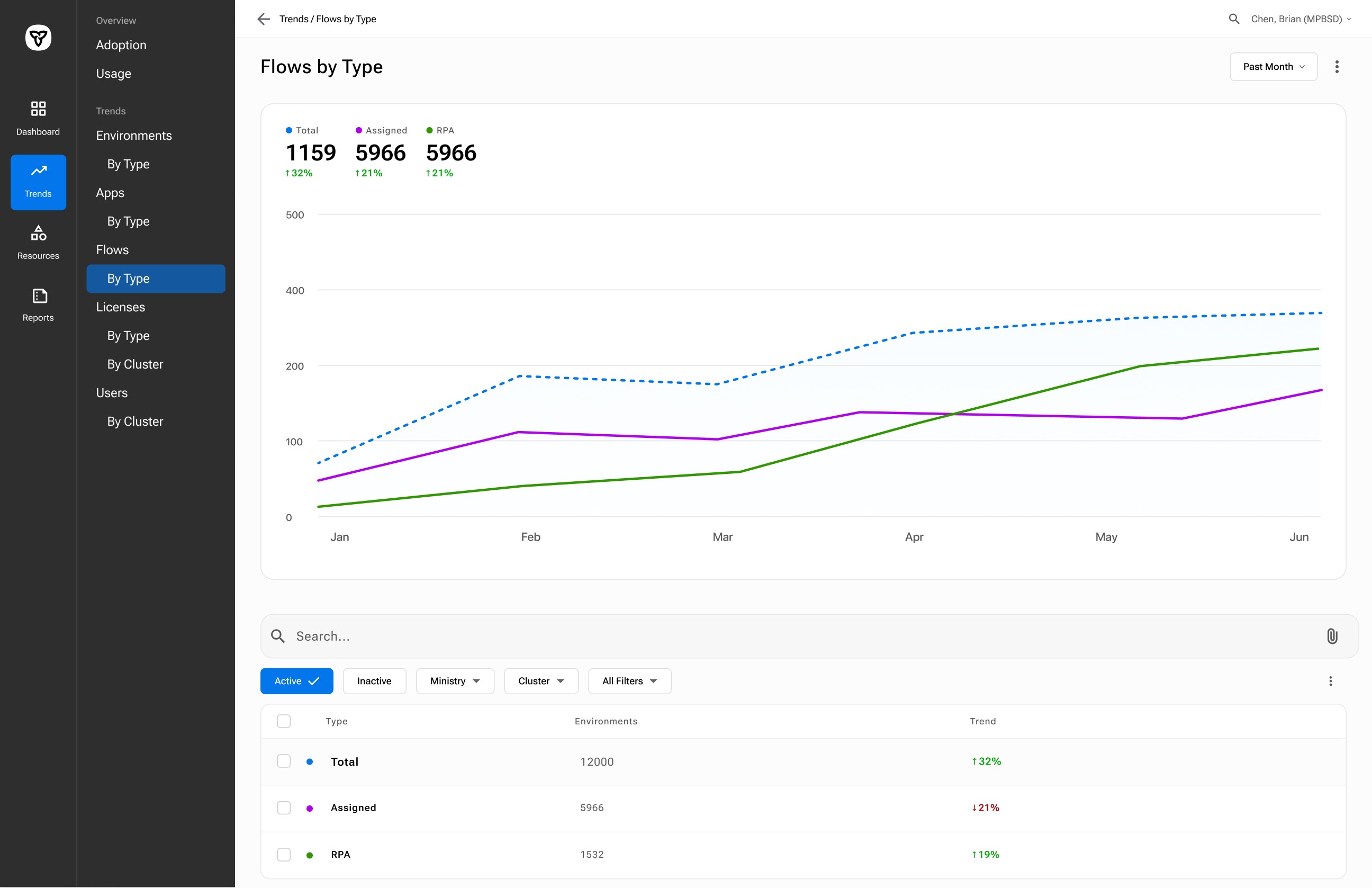
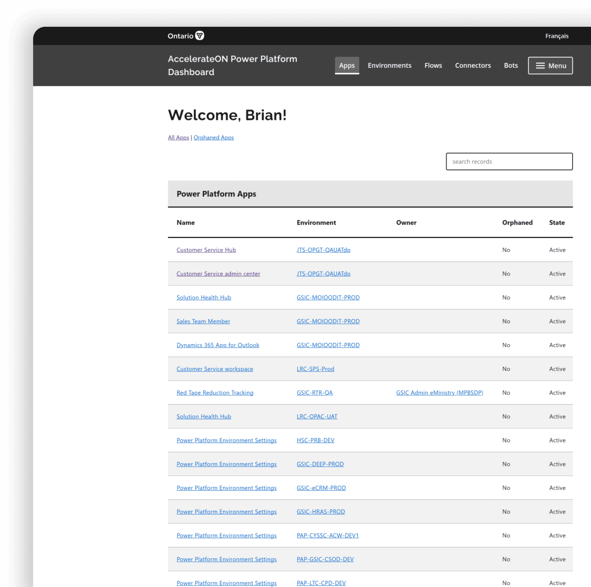
MVP of a Dashboard to track PowerPlatform KPIs and Resources

The Ontario Public Service maintains a database that tracks and displays PowerPlatform usage and resources. However, managers found the database insufficient. Retrieving information on resources, such as licenses or environments, is slow and the database does not display key KPIs. Over four months, I created an MVP for a new dashboard to replace the existing database.


As the sole designer I led the process from problem definition to a high fidelity prototype. The outcome was a new dashboard that enables managers to search for information faster, track KPIs in real-time, and share reports with stakeholders.

My product manager and other management staff found that, while a database existed to track Power Platform resources, it was was difficult to quickly access information on licenses and application usage, and there was no way to monitor KPIs.


Responding to this, I was tasked with exploring a solution for a new analytics dashboard to replace our existing resource database. As the sole designer, I led the process starting with research to define user needs, which eventually led to the design of a high fidelity prototype as an MVP.

My Contributions

Workshops

I led 2 workshops with potential users, and developers on the team to identify the problem space and envisioned future state.

Interviews & Card Sorting

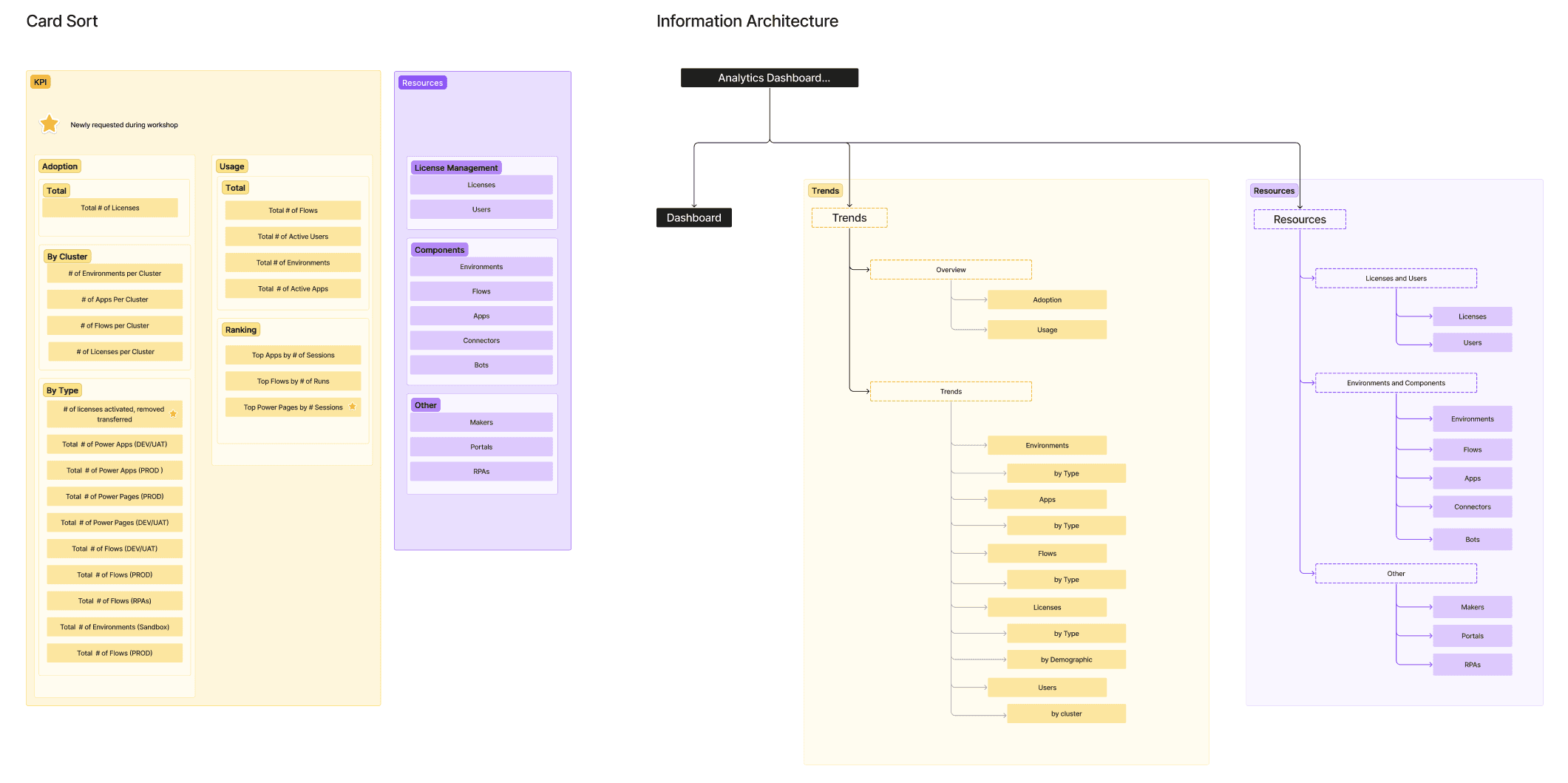
I conducted interviews and card sorting with potential users to identify task flows, KPIS to include, and key goals.

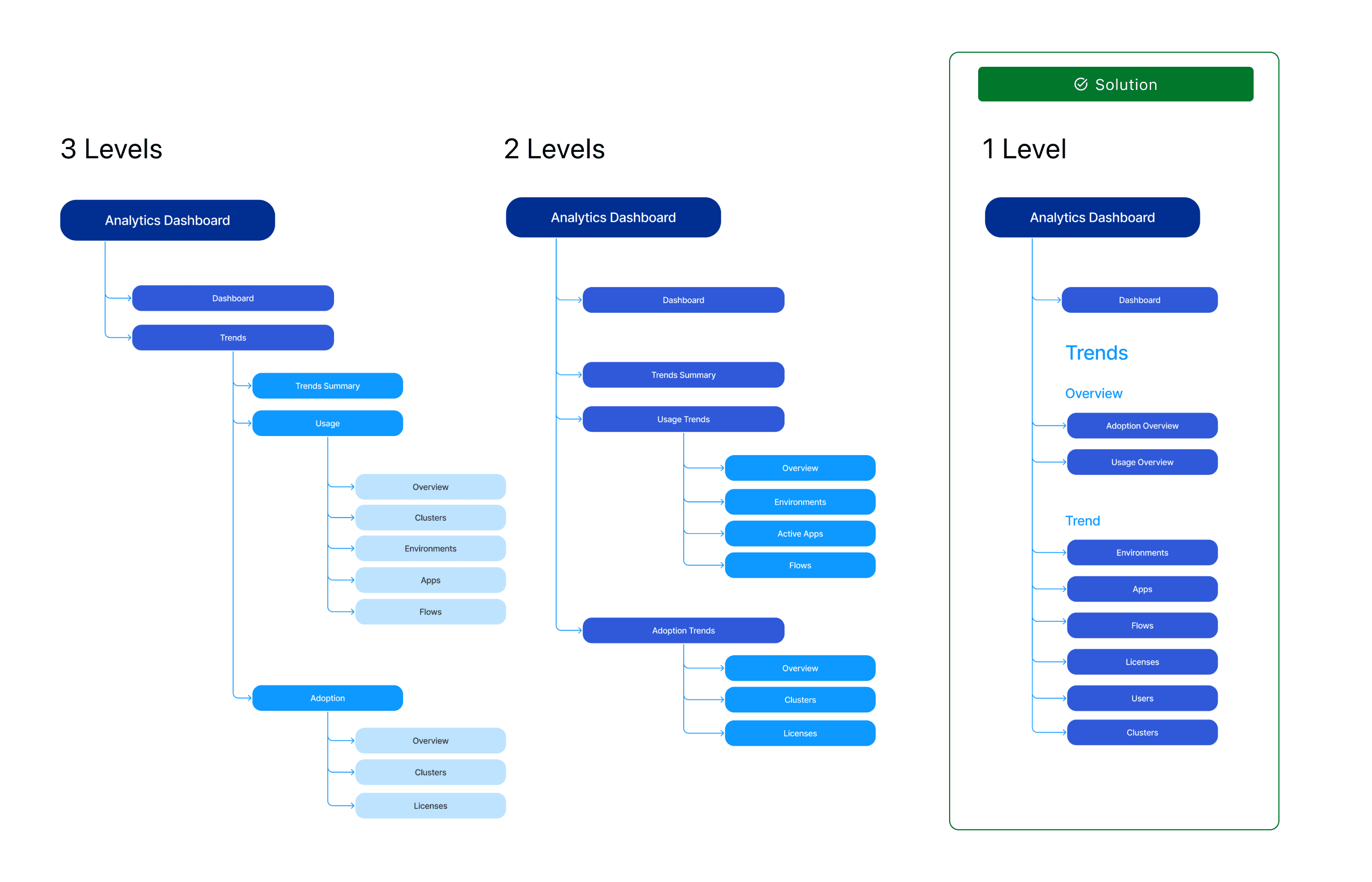
High Fidelity Prototype

I wireframed design options which led to a high fidelity prototype of key user flows and early iterations of a component library.

Final Designs

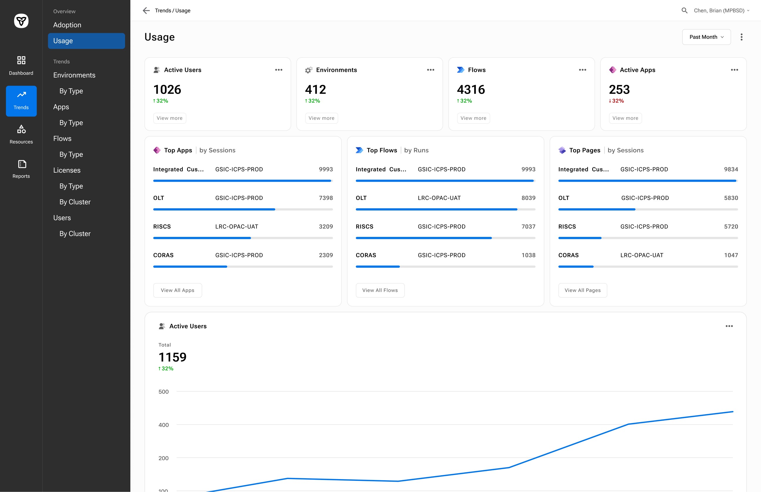
I developed a high-fidelity prototype encompassing five user flows for the minimum viable product (MVP) and conducted usability testing to validate the final design. The design, design system, user interface, and prototyping were completed solely by me, with the exception of some icons, which were sourced externally.

Research Findings

Heuristic Evaluation of Existing Database

I tested the current resource database and identified missing features, data organization issues, and identified what data we have available.

Mental Models around Data and KPIs

Card sorting revealed better ways to organize data and KPIs according to their purpose, and frequency of usage.

User Flows and Goals

Interviews showed common user flows: most tasks involved resource inquiries (multiple at a time) and sharing KPIs for reports and presentations.

Wrapping Up Research.
Shifting to Design Phase.

After the 2 workshops and 5 interviews I had enough information to begin the design process. The research defined key goals and intended outcomes. Feedback on how the data could be organized and clear task flows ensured a clear rationale for design elements like the IA, feature set, and general usability considerations.

Design Studies

Information Architecture based on Card Sort

Information Architecture based on Card Sort

An information architecture was designed and iteratively refined to align with natural groupings of key performance indicators, and task flows identified through user interviews and card sorting.

An information architecture was designed and iteratively refined to align with natural groupings of key performance indicators, and task flows identified through user interviews and card sorting.

Information Architecture Depth

Information Architecture Depth

I conducted usability testing on multiple information architecture (IA) level configurations and determined that a single-level IA is optimal for our use case, which prioritizes quick and efficient data retrieval. The testing also revealed that users did not benefit significantly from the added guidance provided by multiple IA levels.

I conducted usability testing on multiple information architecture (IA) level configurations and determined that a single-level IA is optimal for our use case, which prioritizes quick and efficient data retrieval. The testing also revealed that users did not benefit significantly from the added guidance provided by multiple IA levels.

Navigation and Labelling Improvements

Navigation and Labelling Improvements

Trends were initially grouped under "adoption" or "usage," each paired with an "overview," - as according to card sort findings. The updated solution now separates the links for overviews and trends, simplifying naming conventions and making it easier to locate resource variations such as "Apps" or "Apps by Type."

Trends were initially grouped under "adoption" or "usage," each paired with an "overview," - as according to card sort findings. The updated solution now separates the links for overviews and trends, simplifying naming conventions and making it easier to locate resource variations such as "Apps" or "Apps by Type."

AI Assisted Search

AI Assisted Search

Research showed that it was common to receive a list of user emails and asked to check for their license statuses. For similar use cases I created user flows that use AI to process searches using "messy" text formats such as a long list of email addresses, and file attachments such as spreadsheets.

Research showed that it was common to receive a list of user emails and asked to check for their license statuses. For similar use cases I created user flows that use AI to process searches using "messy" text formats such as a long list of email addresses, and file attachments such as spreadsheets.

Brian Chen

UX Designer

CONTACT

bchen574@gmail.com

Back to Top

Brian Chen

UX Designer

CONTACT

bchen574@gmail.com

Back to Top

Brian Chen

UX Designer

CONTACT

bchen574@gmail.com

Back to Top