Summary
Increasing Engagement and Session Depth on a Museum Website
The Textile Museum of Canada aims to draw new visitors but they found their website had numerous issues. We partnered with them for a class project to redesign their website.
Role & Contributions
Primary designer for hi-fi prototypes
Conducted Usability Studies, Heuristic Evaluations, and Tree Testing with 10 individuals
Deliverables
3 Key Pages Redesigned
New Navigation and Information Architecture
New Design System
Details
Type: Website Redesign
Team: 4 Members
Timeline: 4 Weeks
Role
Prototyping
Heuristic Evaluation
Usability Testing
Tree Testing
Tools
Figma
Optimal Workshop
Overview
Week 1
Client Consultation
We held a workshop session to identify the needs of the client. The museum expressed multiple concerns with their website usability.
Week 2
Research and Testing
We conducted heuristic evaluations, usability tests and tree tests with 10 users to identify key issues.
Week 3
Ideation and Mid-fi Prototype
We reorganized the information architecture, labelling, and redesigned 3 key page layouts.
Week 4
Testing and Hi-fi Prototypes
We tested our new mid-fi prototypes and adjusted them based on our findings to create a high fidelity prototype with a new design system.
Identifying Issues and Designing a High Fidelity Prototype in 4 Weeks
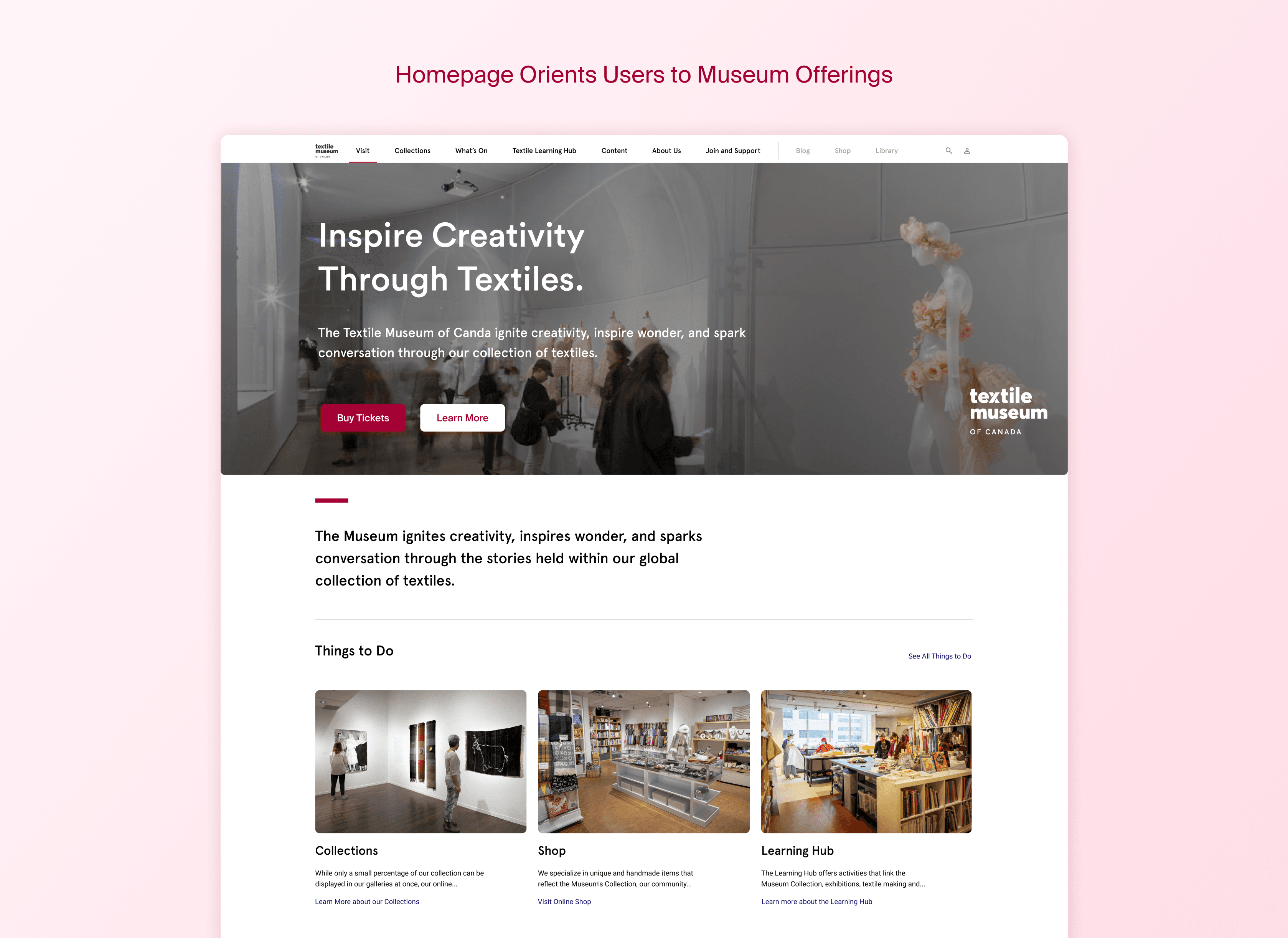
The process involved looking through their website and testing it with users thoroughly to identify the the cause of their issues. After that we redesigned 3 pages with each tailored to meet unique needs.
Problem
Inconsistent UI and Poor Page Organization
To narrow down the problem we conducted Usability Tests, Heuristic Evaluations, Card Sorting, and Tree Testing with 10 individuals.
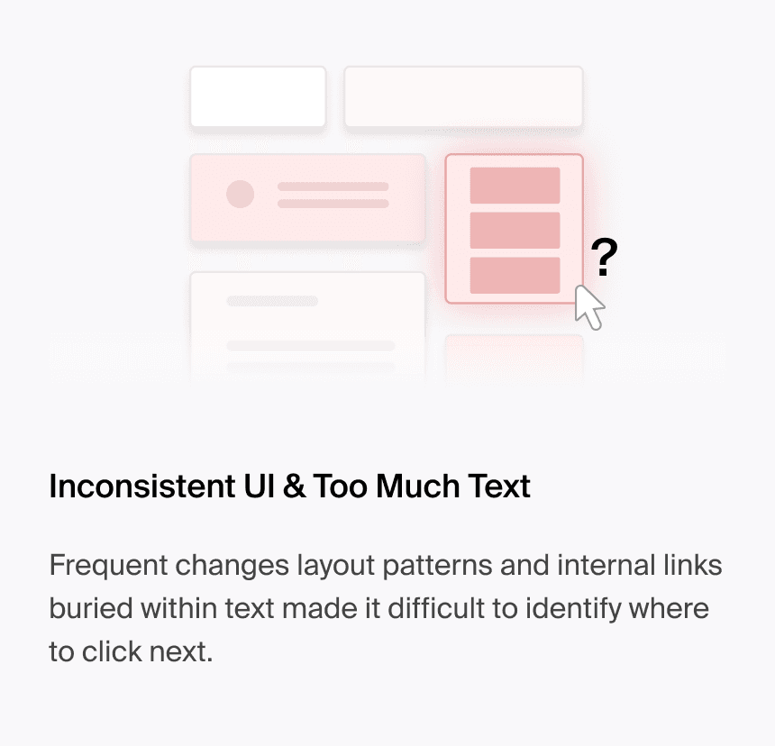
Our insights showed that the current site organization is hard to navigate and the UI is inconsistent, leading to lack of engagement with art and other content.
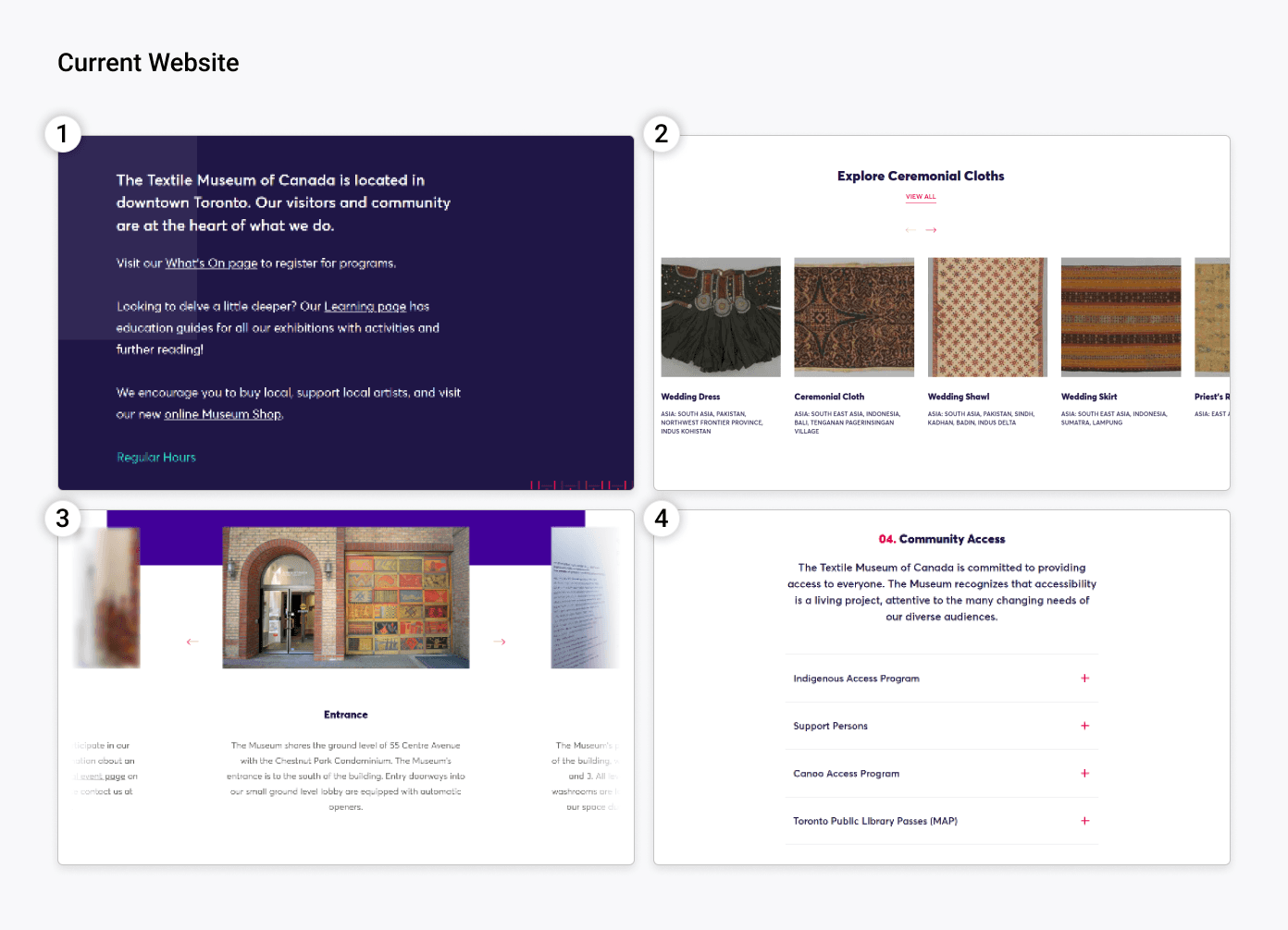
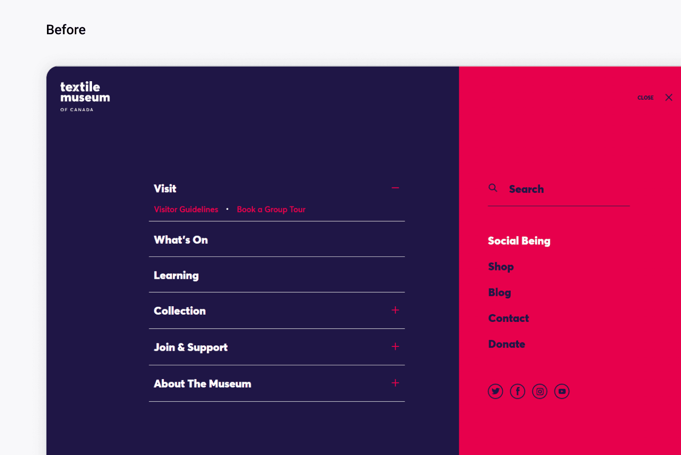
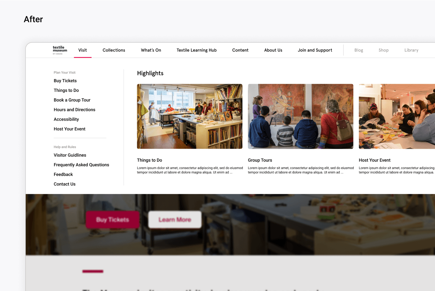
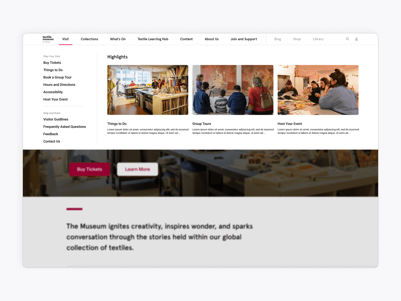
Images of Current Website
Numerous hyperlinks buried within long text.
Collections is split into carousels with ambiguous labels such as "ceremonial cloths".
Image 3 and 4 show simultaneous use of carousels and expandable menus that hide important information.
Design
Improved IA and Labelling Acheives 95% Task Completion
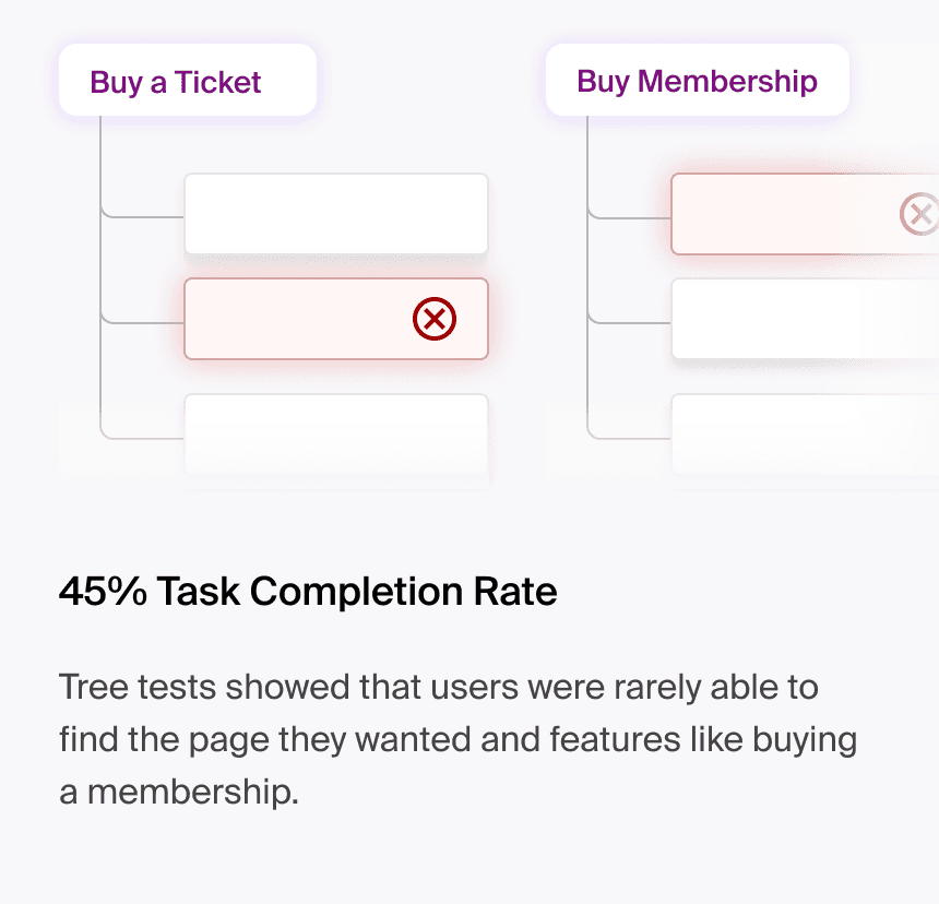
Previously each navigation header had one or two subheadings, leading to only 45% task completion during tree testing. We increased task completion to 95% after adding more sub-headers and improving label names.
Mega Menu Encourages Exploratory Browsing
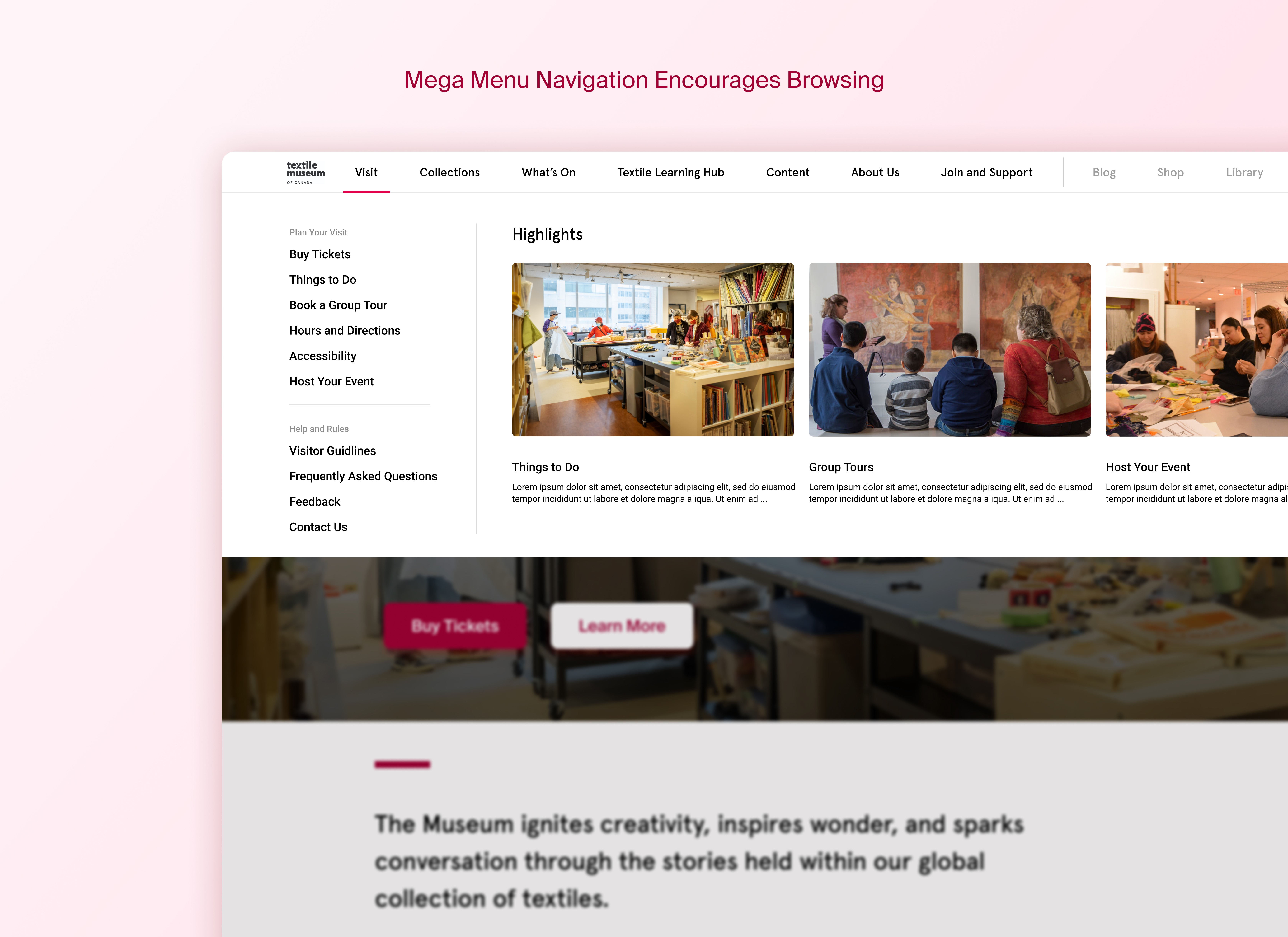
To encourage users to browse deeper into the website we used a mega menu with large thumbnails which brings content from lower level pages forward to motivate users to explore the website further.
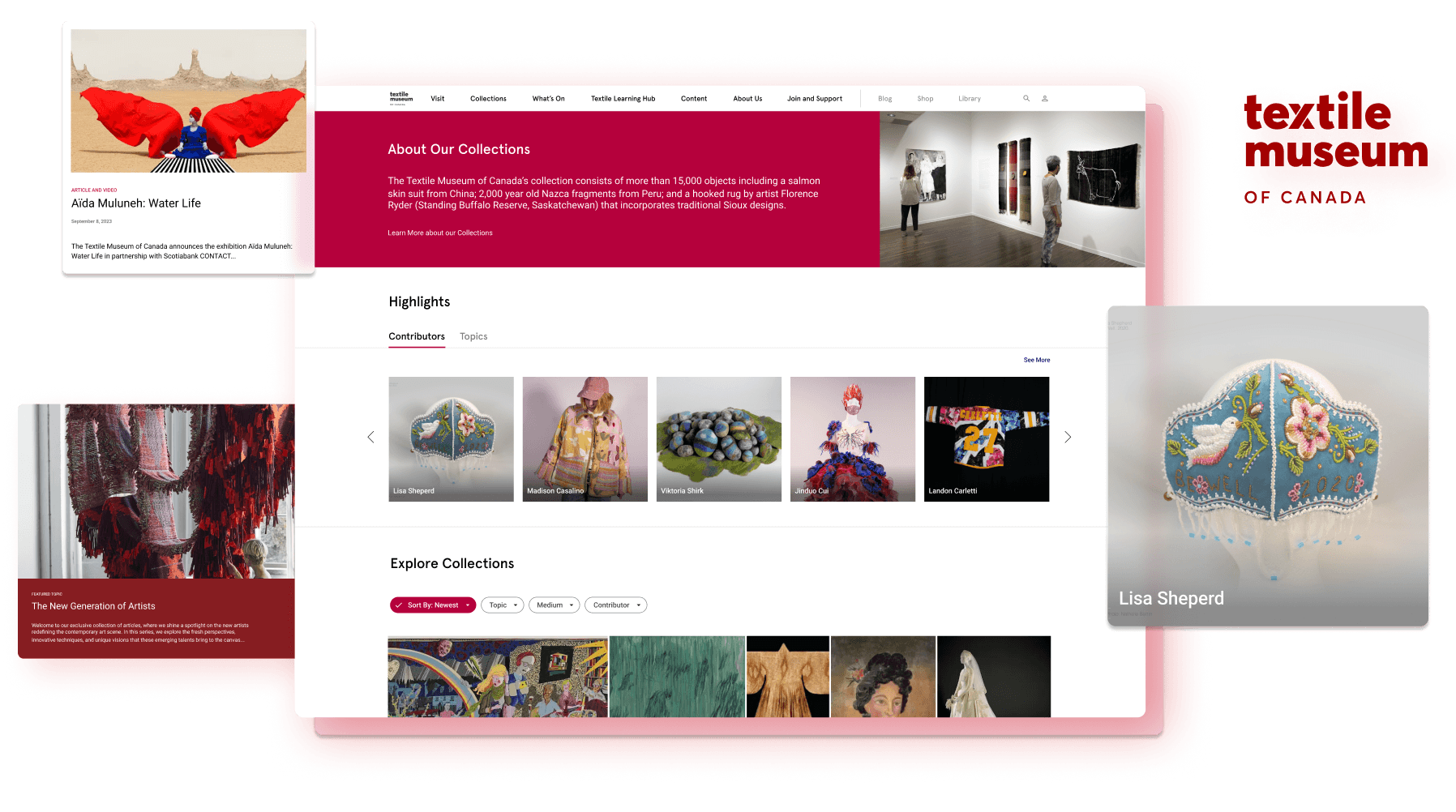
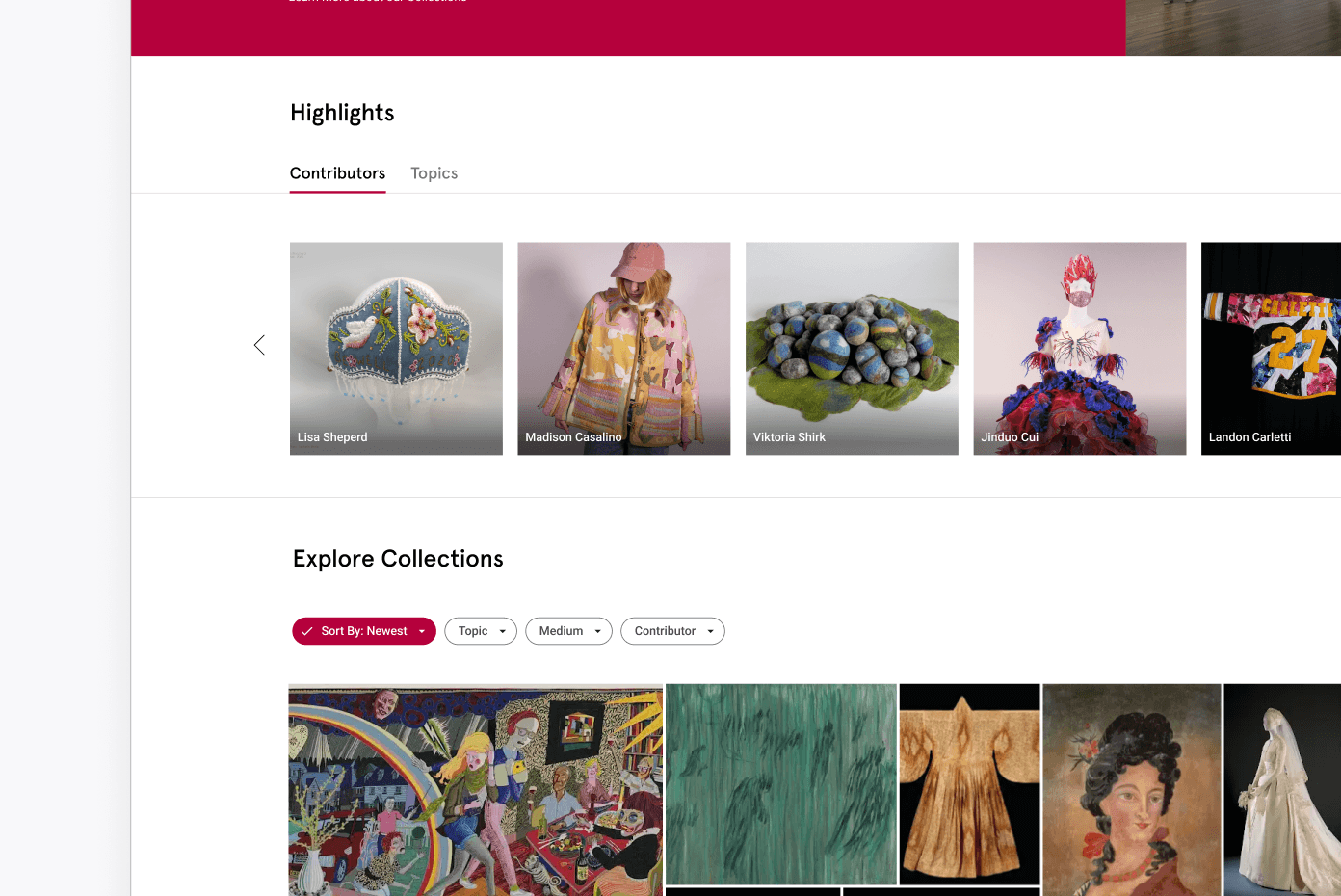
Highlight Artists and Topics of Interest
Organizing the large collection into groups such as featured artists and topics helped users understand what was in the collections and allowed museum to tailor content for their audience.
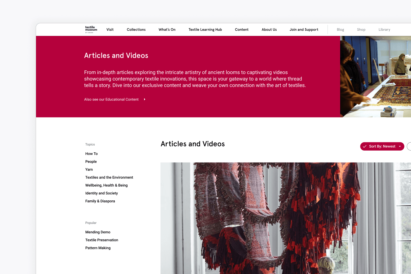
Gather Content on a Single Page and Organize using Local Navigation
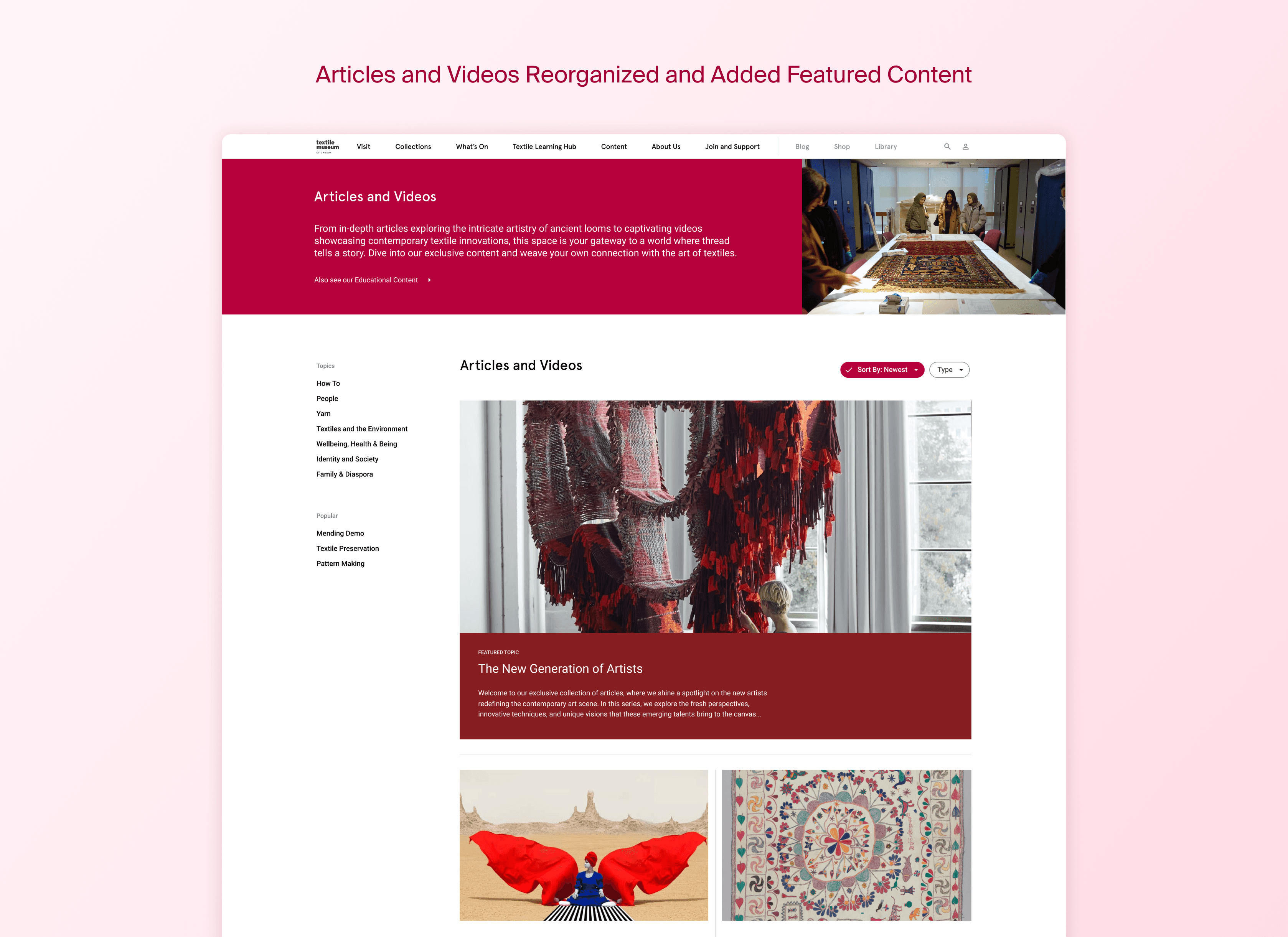
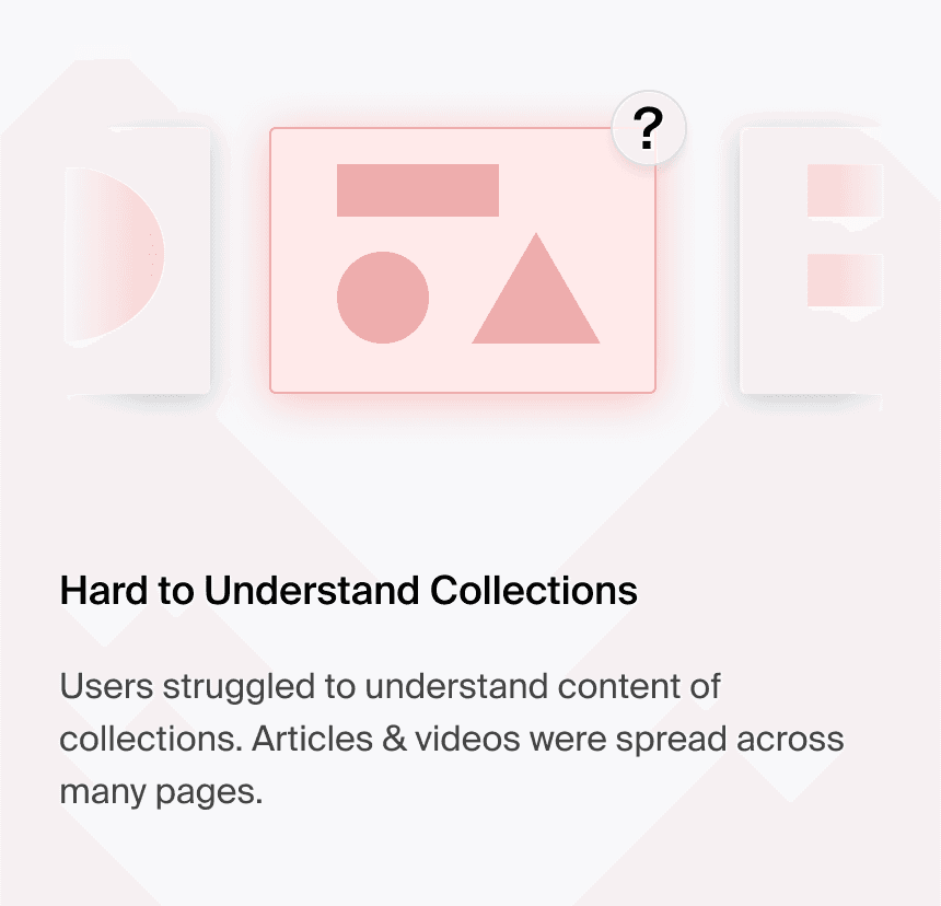
Articles and videos were scattered across numerous pages which confused users. We gathered all articles and videos onto a single page and used local navigation based on topics to help users find content relevant to them.
Conclusion
Further Testing
There are a few more test I would like to conduct to evaluate the success of the project based on comparison between the original and redesigned website. Success metrics would include improved session depth, conversion rate measured as ticket sales or users visiting the museum in person, and measuring user satisfaction when browsing for art and content.
