RideFlag App Camera Verification Feature

RideFlag App Camera Verification Feature

RideFlag App Camera Verification Feature

Designed a new feature for camera-based passenger self declaration for carpool lanes.

Designed a new feature for camera-based passenger self declaration for carpool lanes.

Summary

Led design of a new feature for camera-based passenger self declaration for carpool lanes.

The RideFlag app uses a camera to verify number of passengers for High Occupancy Vehicle (HOV) compliance. During my internship at RideFlag, I led the design for a more convenient alternative individual verification feature for back seat passengers who may struggle to adjust their seating position for group facial verification.


I created prototypes for six user flows and also two alternative versions for users concerned about storing facial images within the app.

Details

Type: Internship

Timeline: 3 Weeks

Prototyping

Heuristic Evaluation

Ideation

Figma

Make verification easier for backseat passengers?

How Verification Works

To ensure compliance with High-Occupancy Vehicle (HOV) lane requirements, which mandate a minimum number of passengers per vehicle, RideFlag uses camera verification to confirm the number of occupants before and after each trip.

Solving Difficulties for Backseat Passengers

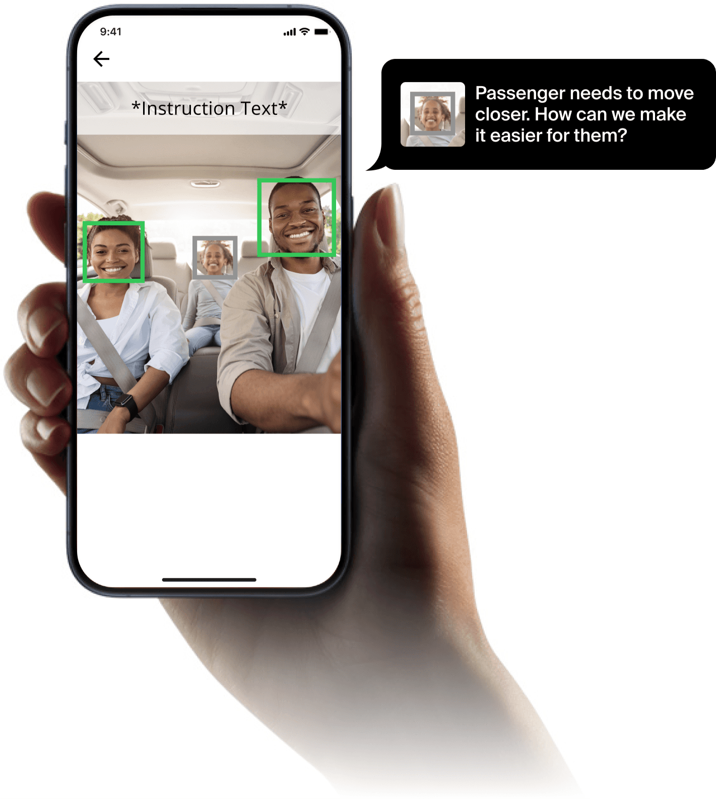
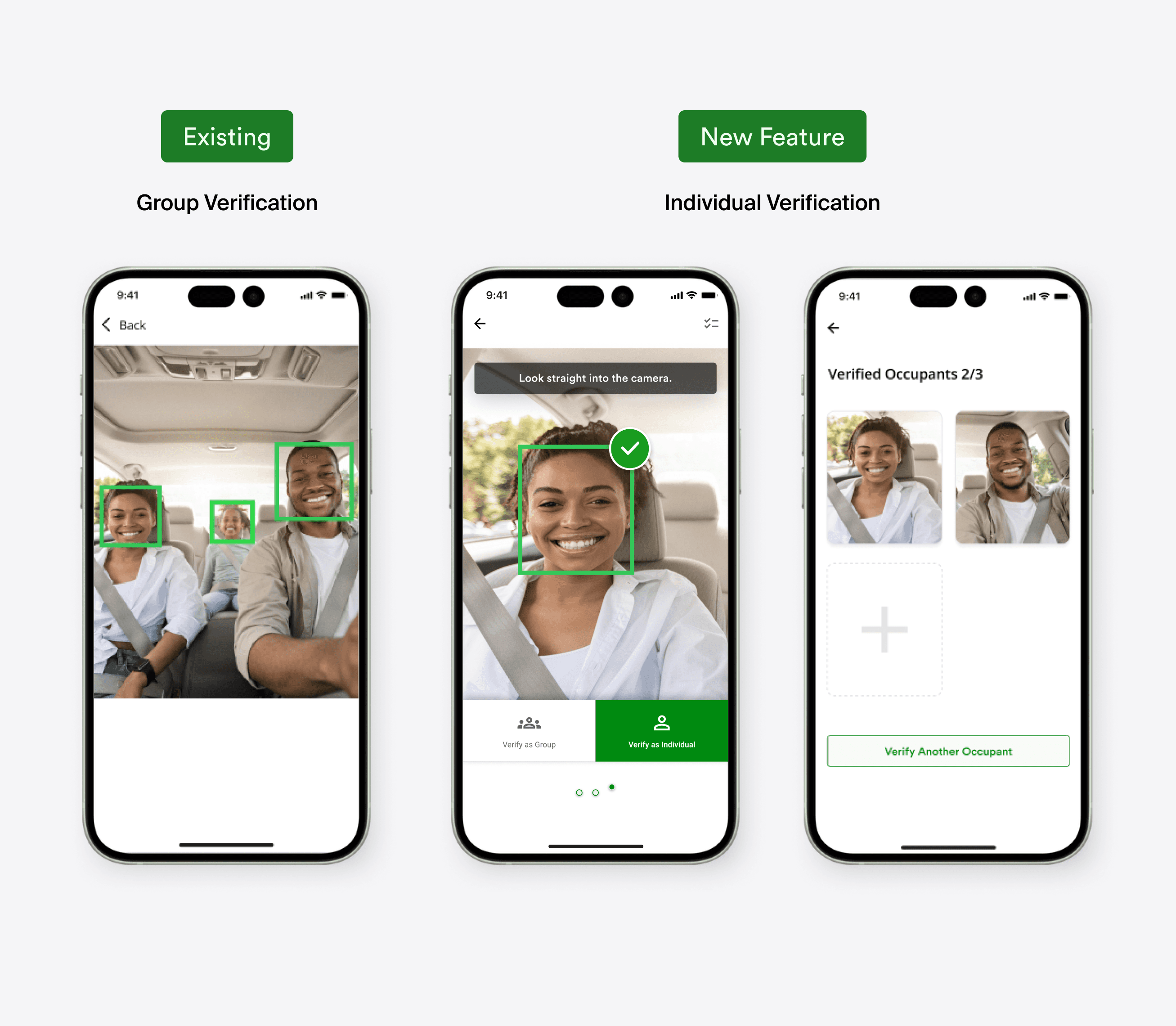
Currently, all passengers must fit within the same camera frame, which often requires repositioning or moving closer—a challenge for young children and older adults. An individual verification feature would allow these users to simply hold the phone and verify in a comfortable position.

Challenges

Working within existing feature constraints and addressing user's sensitivity to data privacy.

The new feature needed seamless integration with existing ones for easy user adoption.


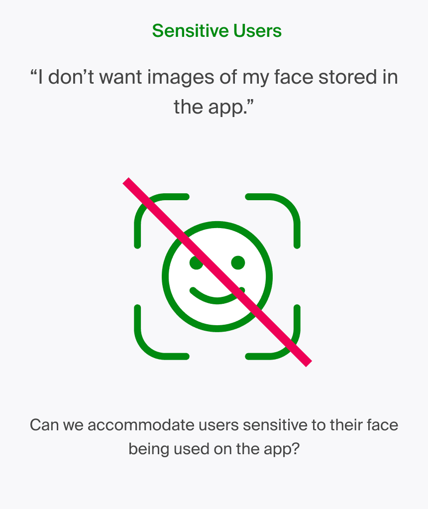
Additionally, some users were sensitive to the app temporarily storing facial images, based on previous testing and feedback.

Design
Seamless Integration

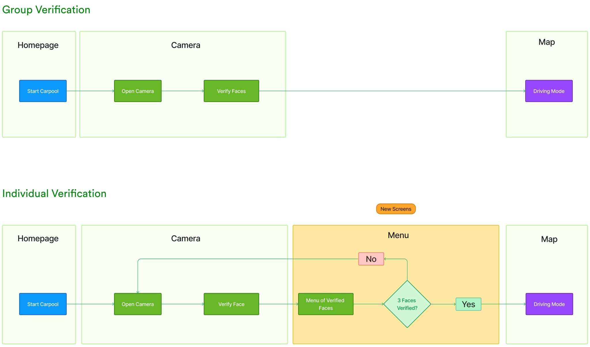
The new feature needed to be similar to the existing group verification process to ensure easy adoption.

I streamlined the new feature to require just one additional screen.

Instruct Users without Instructions

Testing showed that users are often in a rush, so the feature needed to be intuitive even without written instructions.


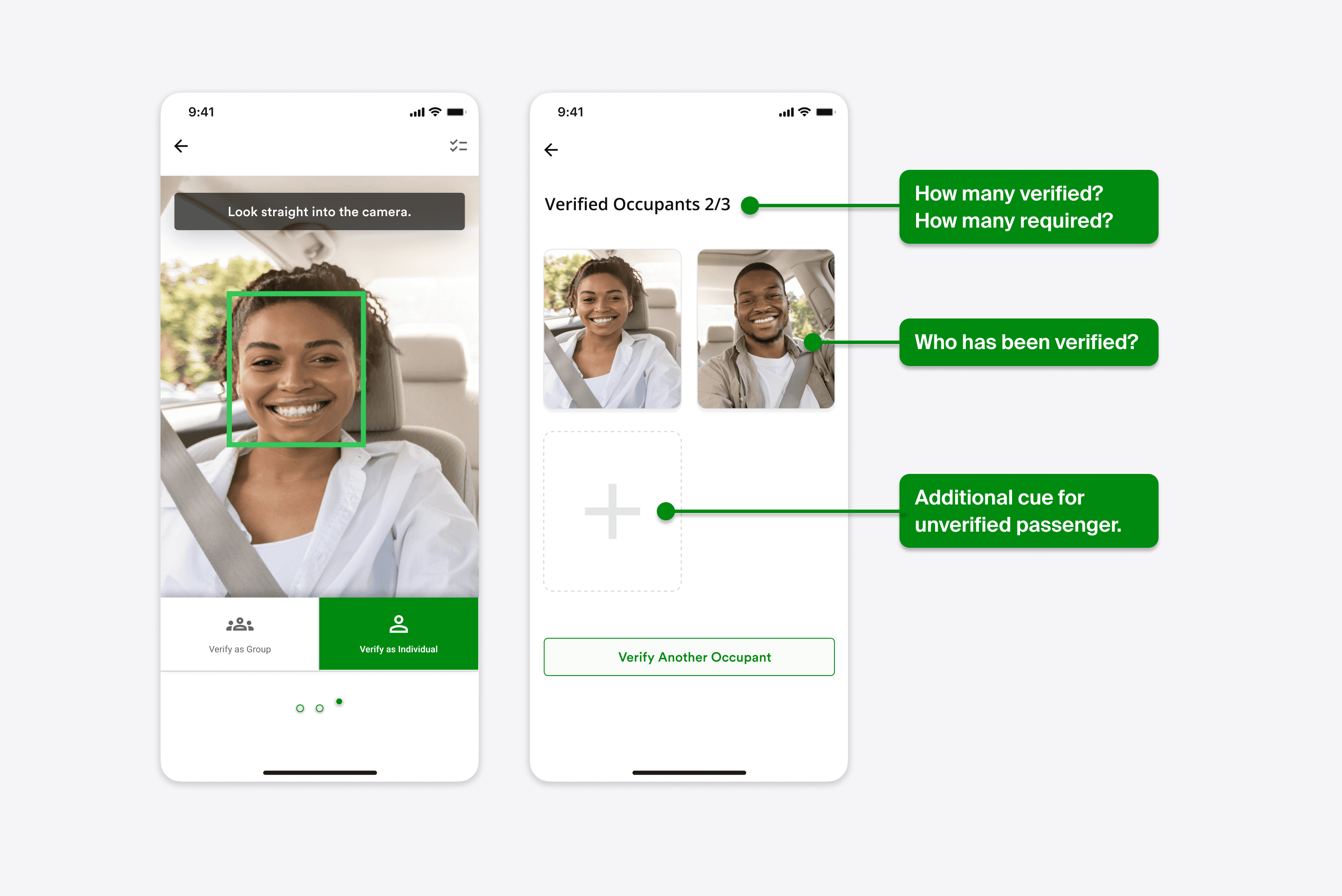
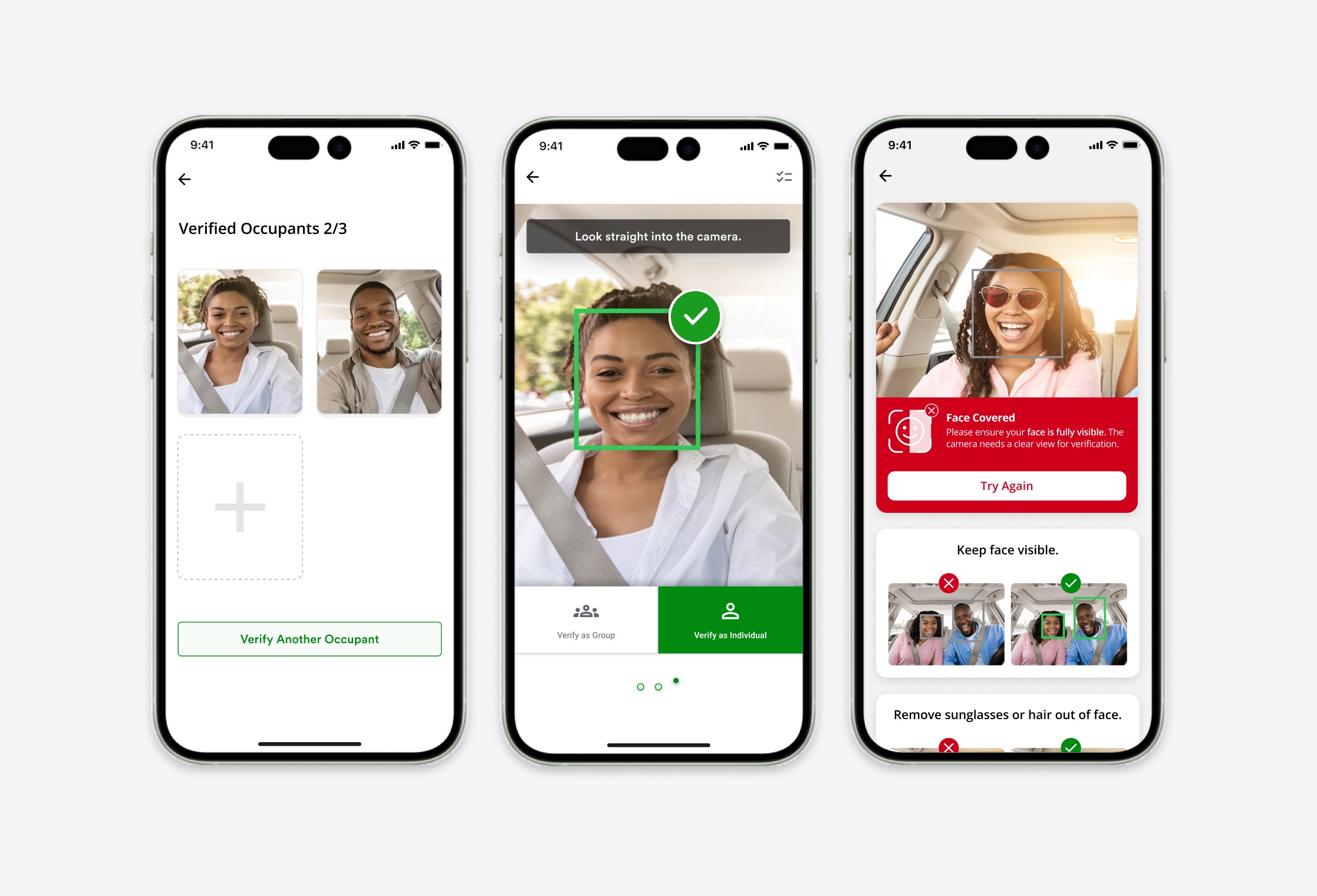
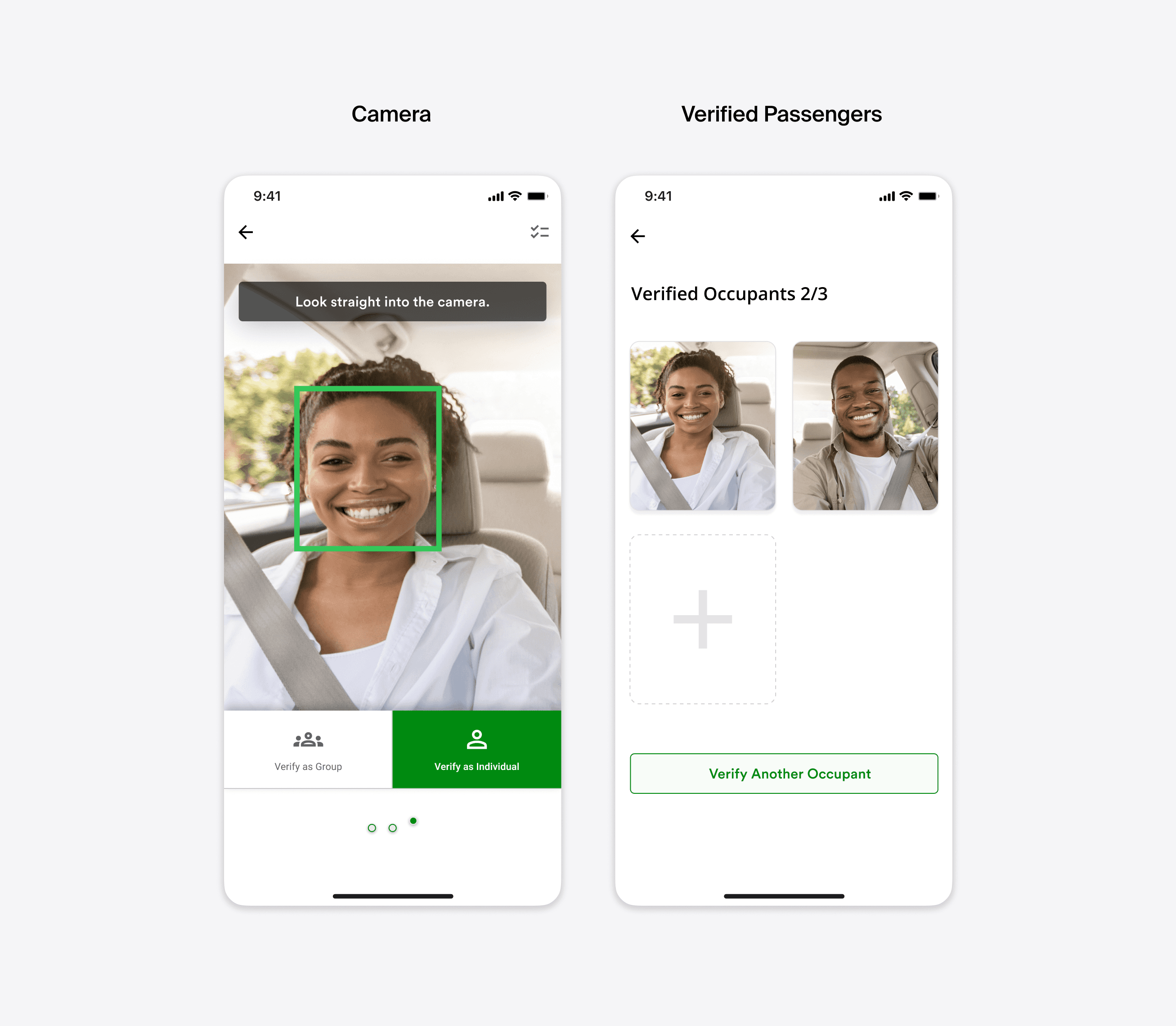
My solution removes the need for text and labels by guiding the user through a card-based metaphor. Cards with faces indicate verified passengers, while empty cards with a plus sign represent passengers who still need to be verified.

Testing showed that users are busy and focused on their upcoming commute, so the feature needed to be intuitive even without written instructions.


My solution guides the using the metaphorical affordance. Cards with faces show who has been verified, empty cards with a plus sign show passengers yet to be verified.

Toggle Button is better than an additional screen.
Previous testing sessions and user feedback suggest that users will default to group verification and have little patience for additional screens.


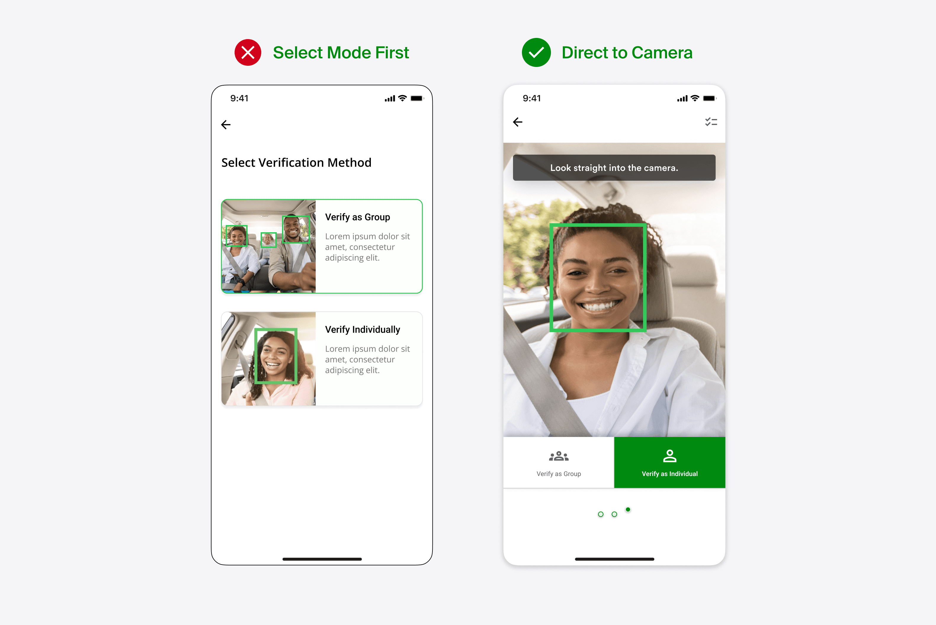
The solution was to use a toggle button directly on the camera screen rather than another screen to pick from individual vs group verification.

Previous testing sessions and user feedback suggest that users will default to group verification and have little patience for additional screens.


My solution was to use a toggle button directly on the camera screen rather than another screen to pick from individual vs group verification.

Previous testing sessions and user feedback suggest that users will default to group verification and have little patience for additional screens.


My solution was to use a toggle button directly on the camera screen rather than another screen to pick from individual vs group verification.

2 Additional User Personas

Based on feedback from our users I identified 2 additional User Personas that would fundamentally impact the new feature:


  1. Users Sensitive to Use of Facial Images

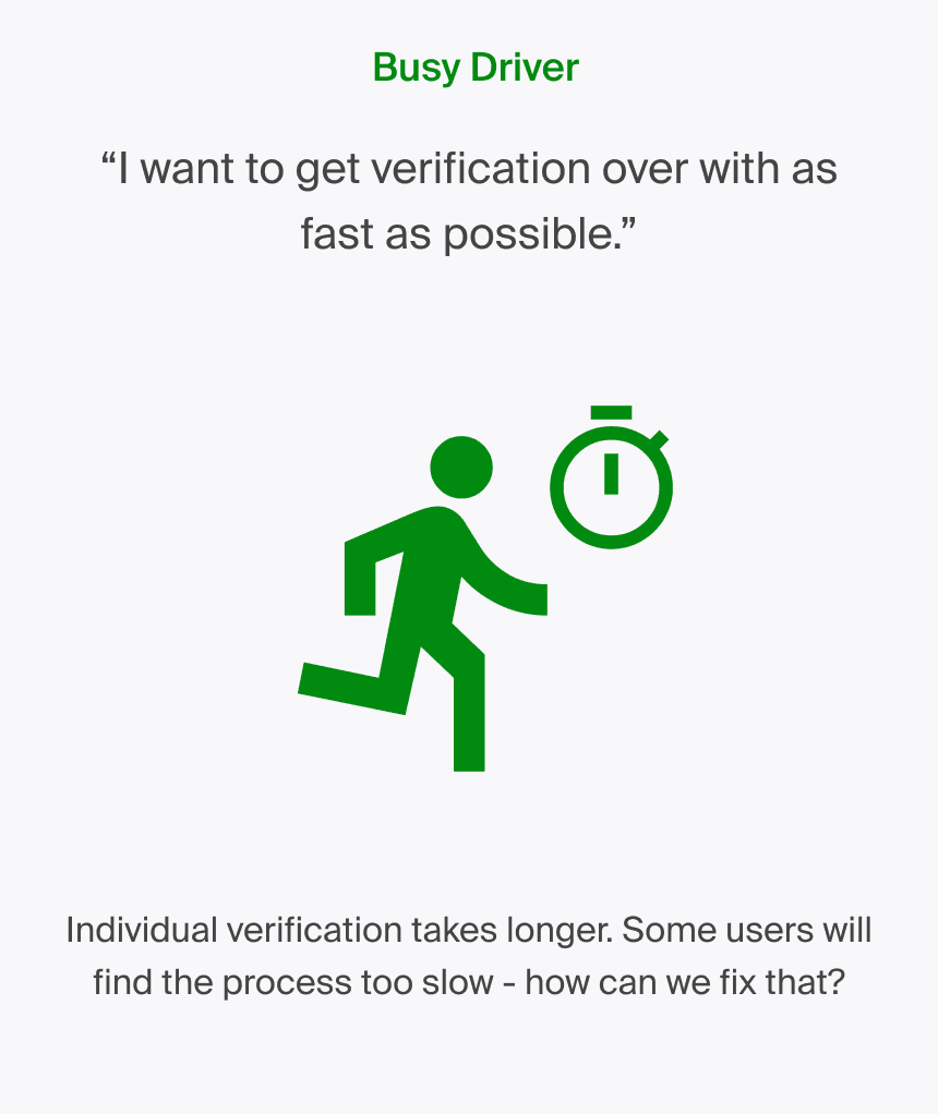
  2. Users Too Busy for Individual Verification

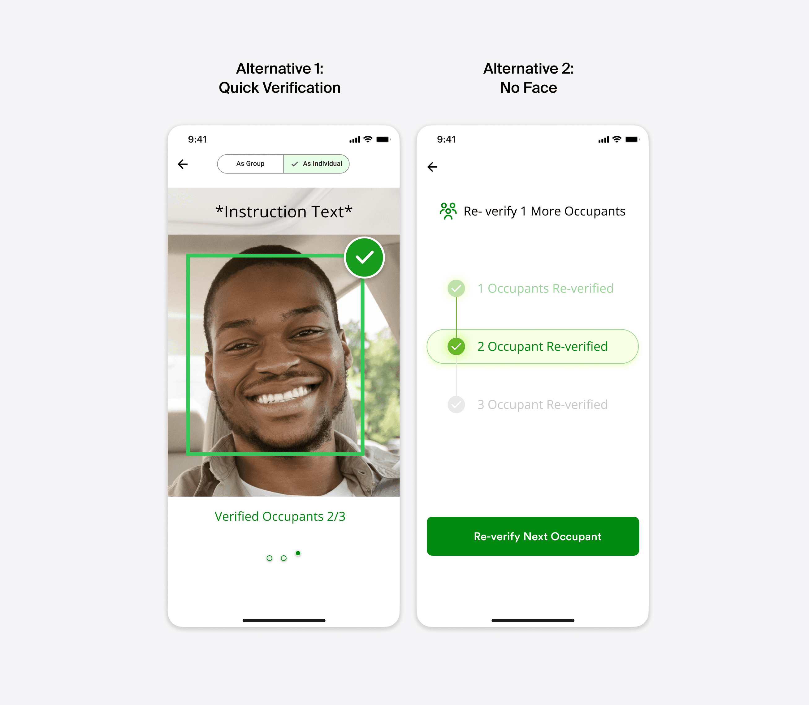
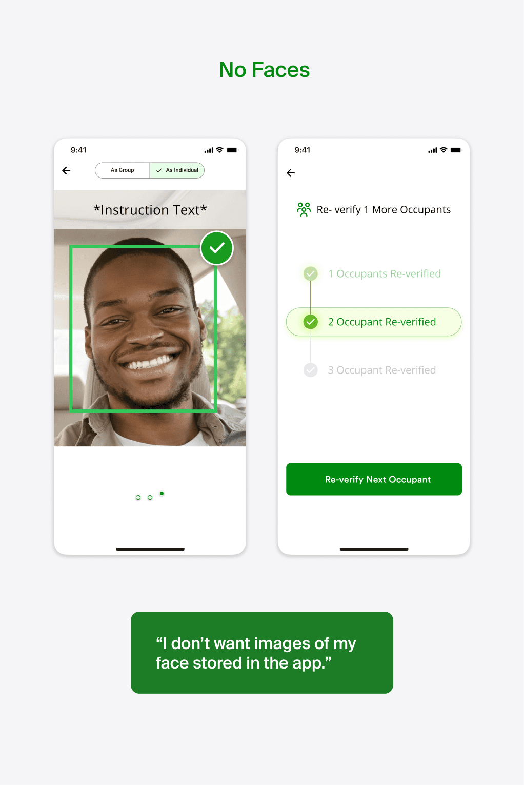
Quick Verification and No Face Option
The two user personas led to alternative design options which will depend on a given client's needs and each state's unique requirements for deployment.


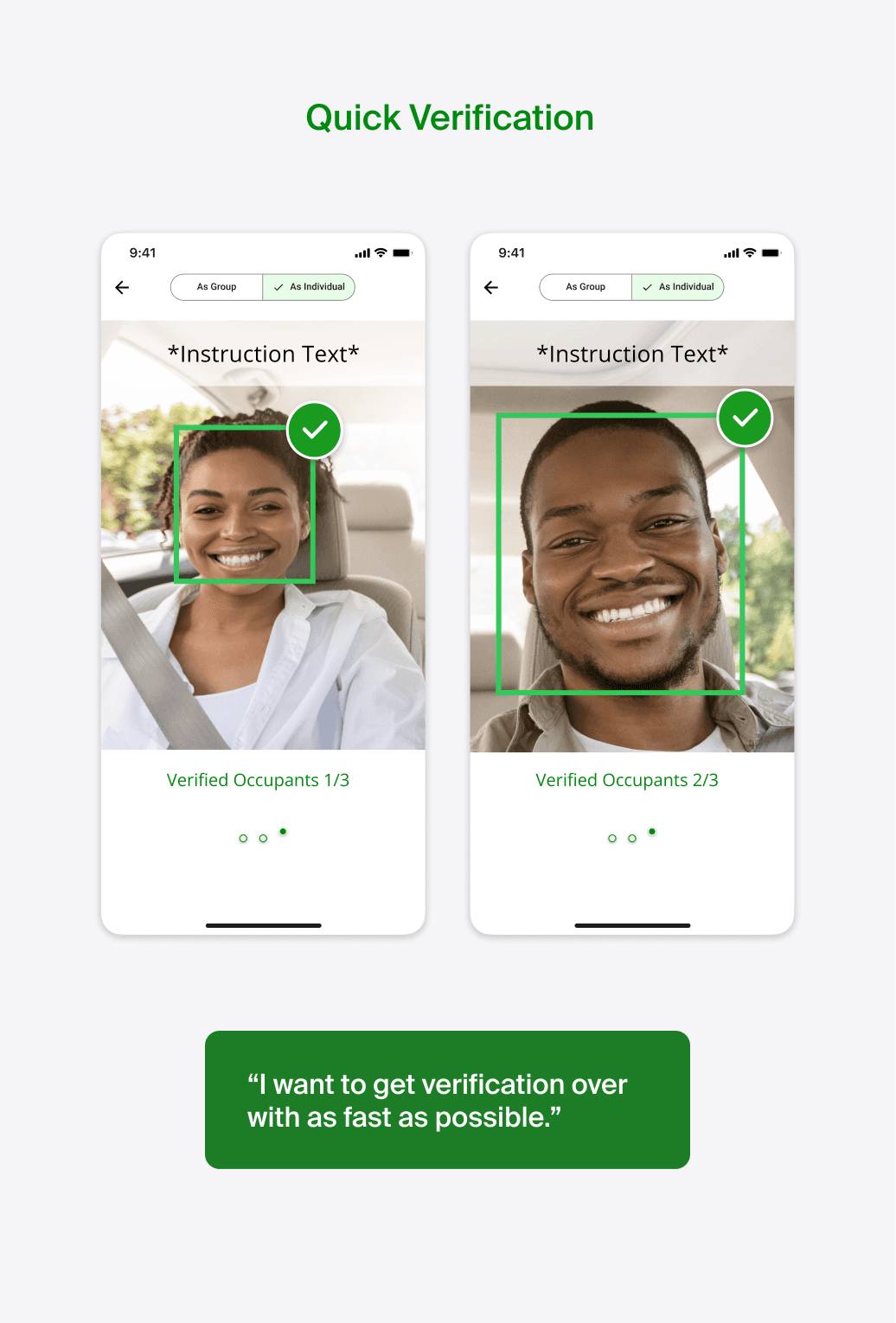
  1. Quick Verification: Allows for individual verification while keeping the camera screen open.

  2. No Faces: Using a progress bar UI rather than images of faces.


Although each option has unique benefits they also come with their own drawbacks.

Error Recovery

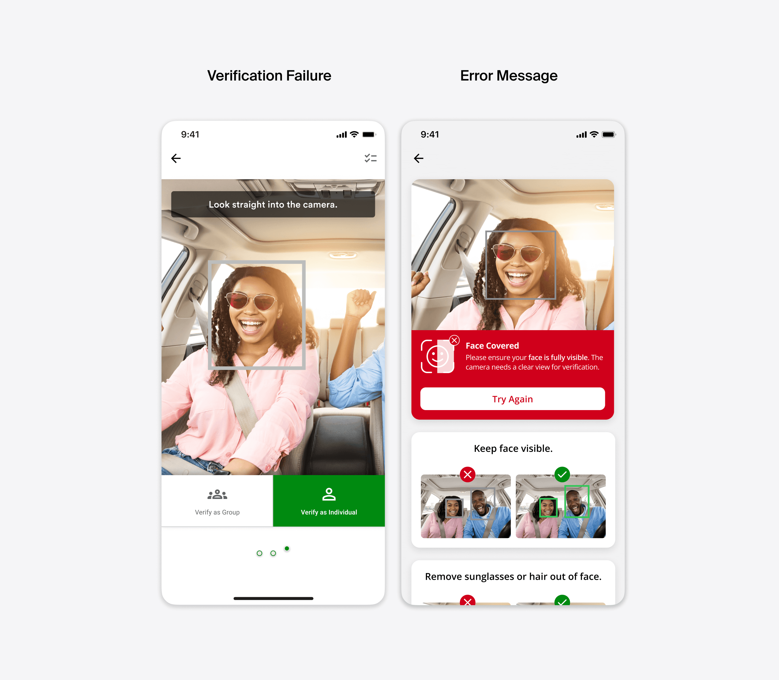
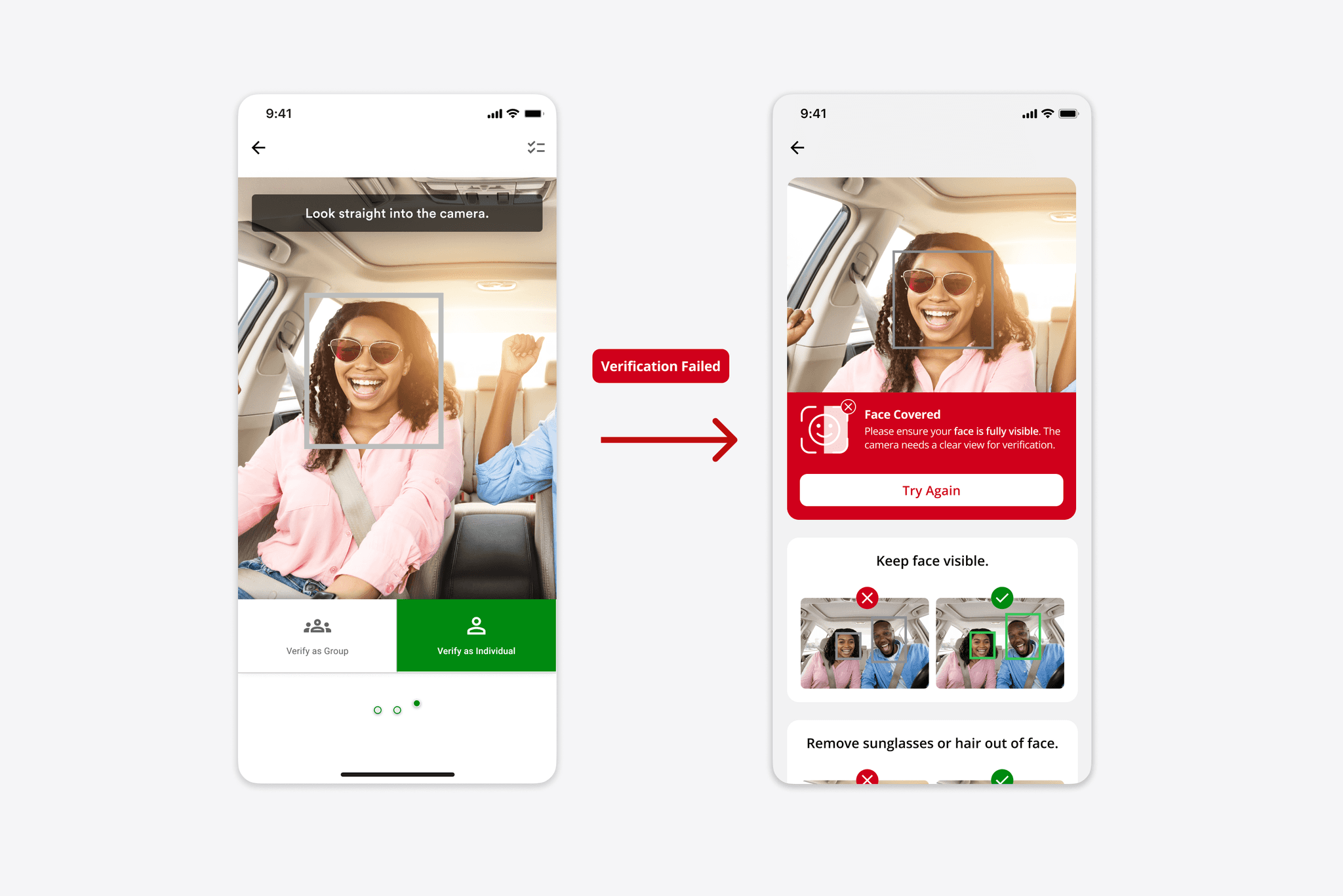
I also developed a user flow to handle camera verification failures. Users are directed to an error screen that provides a clear description of the issue along with actionable tips to resolve it

Conclusion

Further Testing the 3 Design Options with Defined User Segments

After presenting my designs to the team, opinions were divided. Some team members favored the convenience of the 'quick verification' option, while others appreciated the guidance provided in the default option. The option without images of faces was the least preferred but may be necessary during actual deployment. These designs will need to be tested with real users, as behavior may vary depending on the app's deployment state.
Brian Chen

UX Designer

CONTACT

bchen574@gmail.com

Back to Top

Brian Chen

UX Designer

CONTACT

bchen574@gmail.com

Back to Top

Brian Chen

UX Designer

CONTACT

bchen574@gmail.com

Back to Top